
Python数据处理学习笔记 - matplotlib API篇
这是我阅读《用Python进行数据分析》一书的笔记、实验和总结。本篇文章主要讲解pandas包中两大数据结构的图像绘制方法,以及matplotlib API的大致继承关系、使用流程。关于绘图,本文远远未完全覆盖,具体使用请参考matplotlib API手册。
约定俗称的,引入以下包。
import numpy as np
import pandas as pd
np.random.seed(12345)
import matplotlib.pyplot as plt
import matplotlib
%matplotlib inline
plt.rc('figure', figsize=(5, 4)) #rc属性指定一个变量按照某些参数全局使用。
np.set_printoptions(precision=4, suppress=True)
1. matplotlib简要介绍
Matplotlib的层次如下:
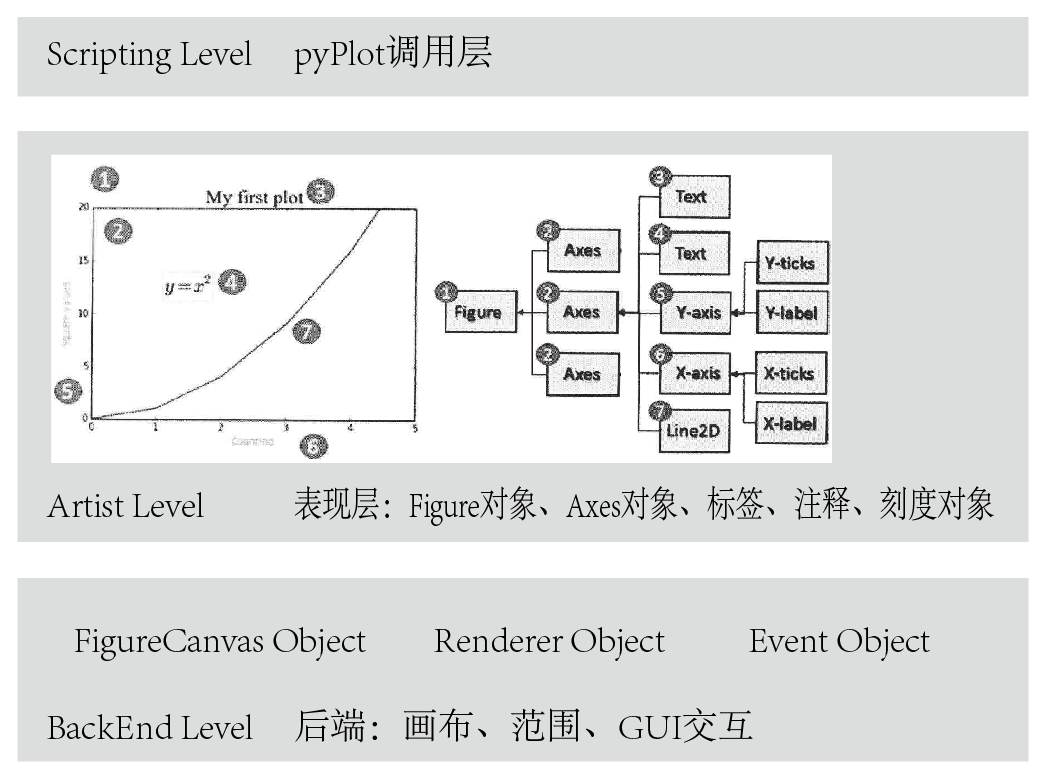
其由三个层次构成,最底层提供了画布FigureCanvas、画笔Renderer、鼠标和键盘事件的交互Event,一般来说,我们不会操纵这一层的对象。这一层称之为BackEnd后端,不同的平台有不同的后端,比如GTK后端、Qt5后端和Notebook后端。对于Qt后端,这三者分别对应QtGui.QMainWindow, QtGui.QPainter以及QEvent。
1.1 BackEnd Layer
BackEnd的这三个常用的模块在mpl.backend_bases类下,其中包含了各种键盘、鼠标的Event类、用以绘制线段、图形的RenderBase类、负责将Figure对象和其输出分离开的FigureCanvasBase类等(只是一个接口,具体不同输出,比如PDF、PNG的定义在backends类中)。即,所有派生/输出的方法都放在mpl.backends下,比如Qt5后端为mpl.backends.qt5agg。输出PDF的后端为mpl.backend_pdf,这里的类负责和不同的后端/平台进行交互。这样的设计保证了代码的解耦和设计的统一。
不同的后端提供了不同的API,其在backends类中定义,API表现在RenderBase和FigureCanvasBase的调用实际行为不同,比如GDK会调用Drawable API,但是,对于程序来说,其调用接口都是一样的,都存在于backend_bases类下。
此外,mpl使用了C++的"agg"(Anti-Grain Geometry)库来进行证基于像素的绘制,对于2D来说,性能非常好。
对于Canvas、Figure、Axes,下面是一个例子:
#use matplotlib.get_backend() get current backend:
#like that:'module://ipykernel.pylab.backend_inline'
#use %matplotlib inline
#or like that: 'nbAgg' # use %matplotlib notebook

from matplotlib.backends.backend_agg import FigureCanvasAgg
#you can use type(Figure().canvas) get this class
#or use that if you installed pyqt or pyside
#from matplotlib.backends.backend_qt4agg import FigureCanvasQTAgg
#or use that if you don't want a spec choice
#from matplotlib.backend_base import FigureCanvasBase

from matplotlib.figure import Figure
import math

fig = Figure()
canvas = FigureCanvasAgg(fig)
#or canvas = FigureCanvasBase(fig)
ax = fig.add_subplot(111)
ax.plot(range(10),list(math.sin(x) for x in range(10)),'-')
canvas.print_png('plt.png')
#if you use FigureCanvasBase, you need run
#canvas.print_figure('plt.png')
Event的例子如下:
def on_press(event):
    pass

fig, ax = plt.subplots(1)
fig.canvas.mpl_connect('key_press_event',on_press)
#注册事件到canvas中。
#Connect event with string s to func.
ax.plot(np.random.rand(2,20))
plt.show()
1.2 Artist Layer
如果说BACKEND层做的事情是确立了一个CANVAS、RENDERER、EVENT的架构,那么ARTIST层所做的事情就是告诉程序,在RENDERER上画什么东西到CANVAS上。这一层不用接触后端,不用关系不同实现方法的差异,只需要告诉BACKEND层需要draw的内容即可。
所有的元素都是mpl.artist.Artist类的实例/子类。artist Module包含大量已经定义的元素,包括Tick刻度、Text文本、Patch复合图形(坐标轴、阴影、圆、箭头、Rectangle等)、Figure图形、Legend标签、Line2D线段、Axis坐标轴、Axes复合坐标轴。artist Module中的元素通过draw方法和backend Module进行交互和信息传递,传递是单向的。
打个比方,这一层就像HTML,里面有很多元素,我们需要选择一些元素呈现在Canvas上。这些元素可能单独呈现,或者是编成组共同呈现,可以将其粗分为三类:
-
Containers like Figure、Subplot、Axes 容器,包含了几个元素
-
Primitives like Line2D、Rectangle 单一元素,比如线段等
-
Collection like PathCollection 集合,包含了较为类似的几个元素
在使用的过程中,我们不会经常用到OOP的方法,而是经常用到一些复合比如Containers,像Axes等。需要注意的是,mpl.figure.Figure(通过mpl.figure()调用)是这一层的最顶级对象,所有其余Artist子对象都要画在一个Figure上。通过mpl.figure()来新建一个Figure对象的实例,然后将所有的其余元素定向到这个Figure实例上,最后Figure().show()即可完成绘制。
Axes是第二个较为重要的层,每个Figure只有一个Axes对象,这个对象包含大量的子元素,包括线条、文本、坐标轴复合对象等等。之所以和Figure进行分离的原因是,Figure用来控制尺寸等一些和元素无关的属性。Axes则用来管理内部的元素。通过Figure.add_axes()可以创建一个axes。或者,直接调用fig,ax = mpl.plt.subplots(n)一次创建这两个对象。
第三个重要的层是x(y)axis,这个层也是一个复合对象(实际上是mpl.axis.Axis和mpl.axis.Tick两个类),包含X或者Y轴的元素,包括刻度(Ticks)、刻度文字(Tick Labels ; Offset text),轴标签(Axis Label)等。这一层里用来控制图形的尺度,比如x/ylim用来控制坐标轴范围。比如xlabel用来设置label的一些属性,比如字体大小、旋转、颜色、背景和透明度等。
自然,我们不需要按照OOP的方法来使用mpl.实际上,Axes.plot等同于mpl.lines.Line2D调用,Axes.hist等同于mpl.patch.Rectangle调用,mpl提供了很多高层次的快捷属性和方法用于简化操作。
1.3 Script Layer
如果说上一层代表了HTML,那么这一层就代表了JavaScript,你可以将这一层看作带有状态保持的交互界面。比如Python的那个交互解释器一样。mpl.pyplot是这一层的全部入口。
import matplotlib.pyplot as plt
plt.figure()
plt.plot(np.random.rand(2,100))
plt.show()
##########################################
plt.figure()
plt.plot(xxx)
plt.show()
plt.close()
2. 使用PYPLOT进行绘图
2.1 plt.plot()绘图
2.1.1 快速上手plot()绘图
这种图形绘制方法是完全的通过pyplot解释层进行绘图。当调用plt.plot()方法的时候,如果系统没有检测到存在Figure对象和Axes对象,则会创建一个,如果检测到,则直接使用。创建后选择的后端为默认后端,canvas一般为mpl.backends.backends_xxagg类。
plt.plot(np.random.randn(50).cumsum(), 'r--.')
pyplot.plot 可以接受绘制对象和一些类似于命令行的参数,可选颜色、点线状态(水平线、垂直线、星标)等各种形状。plot的参数参见Line 2D,可以这样指定:plot(x, y, color='green', linestyle='dashed', marker='o',markerfacecolor='blue', markersize=12)
pyplot可以直接按照面向过程方式处理,调用plt.axis会对当前Axes中的axis属性进行设置。
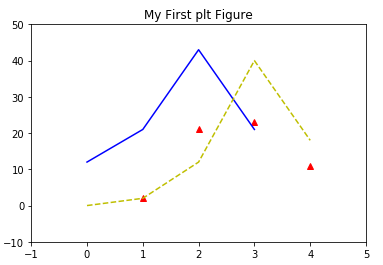
from matplotlib.pyplot as plt
plt.plot([1,2,3,4],[2,21,23,11],"r^",[12,21,43,21],"b",[0,2,12,40,18],"y--",)
#x轴、y轴和其颜色、类型、第二个y轴和其颜色、类型、第三个y轴和其颜色、类型
plt.title("My First plt Figure")
plt.axis([-1,5,-10,50])
#sets the min and max of the x and y axes, with v = [xmin, xmax, ymin, ymax]
plt.show()
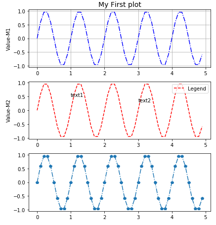
2.1.2 子图形、标签、刻度、文本
通过面向过程的方法,我们可以快速进行图像绘制,其中有一些比较重要的方法,比如:
- plt.subplot(m,n,a) 在一个Figure和Axes上绘制多个图形,你可以在任何时候返回这个子图进行修改。
- plt.subplots_adjust() 快速调整图形间距
- plt.title() 设置标题
- plt.grid() 设置网格
- plt.xlabel() 设置x轴标签
- plt.xticks() 设置x轴刻度
- plt.legend() 控制图例显示
- plt.text() 在指定位置放置文本
from matplotlib.ticker import NullFormatter

#设置x轴和y轴的数据
t = np.arange(0,5,0.1)
y1 = np.sin(2*np.pi*t)
y2 = np.sin(2*np.pi*t)

#设置整体图形外观
plt.subplots_adjust(top=2, bottom=0.08, left=0.10, right=0.95, hspace=0.25,
                    wspace=0.35)

#plt.title("My First plot") not work here
#设置第一个子图形的标题、绘图、标签、网格
plt.subplot(411) #用来水平切分4个,垂直切分1个,调用第1个图形
plt.title("My First plot",fontsize=14) #only work here
plt.plot(t,y1,"b-.") #在这里还可以设置绘制的点的样式、颜色等
plt.ylabel("Value-M1")
plt.grid(True)

#同上,调用第二个图形,设置文本和图例
plt.subplot(412)
plt.plot(t,y2,"r--")
plt.ylabel("Value-M2")
plt.text(1,0.5,"text1")
plt.text(3,0.3,"text2")
plt.legend(["Legend"],loc=1) #图例位置和文本内容

#同上,调用第三个图形,gca返回当前instance,设置刻度
plt.subplot(413)
plt.plot(t,y1,"p-.")
plt.gca().xaxis.set_minor_formatter(NullFormatter())#gca获取当前axes,set..设置刻度

plt.subplot(411)
#xxxxxxxxxxxxxxxxxxxxxxxxxx
#你可以在任意时候,回到之前绘制的子图中继续在其上绘制其他图案。比如:
#plt.plot(t,y1,"p-.") #这条命令会绘制在图1中,并且和之前图1存在的内容并存
plt.show()
2.2 Figure和Axes:图形、子图形和其轴
2.2.1 Figure和Axes对象
class matplotlib.figure.Figure
(figsize=None, dpi=None, facecolor=None, edgecolor=None,
linewidth=0.0, frameon=None, subplotpars=None, tight_layout=None)
Figure还有很多方法,常有的有:
- add_axes(rect) 添加子轴
- add_subplot(mna) 添加子图
- clear() 清除图像
- draw(renderer) 底层接口
- gca() 当前Axes
- get_children() 获取子元素
- hold() 丑陋的MATLAB兼容性
- savefig() 保存图片
- set_canvas() 底层接口
- show() 显示图片
- subplots_adjust() 子图微调
- text() 放置文字
class matplotlib.axes.Axes
(fig, rect, facecolor=None, frameon=True, sharex=None,
sharey=None, label='', xscale=None, yscale=None, axisbg=None, **kwargs)
Axes有很多方法,单独方法大约有100种,因此在这里不再举例,可查阅手册。
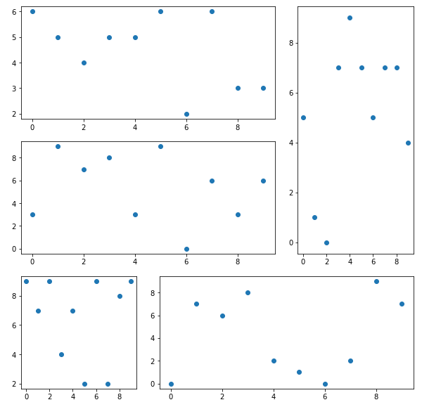
2.2.2 调用和创建Figure和Axes对象
使用plt进行绘图固然很方便,但是有时候我们需要细微调整,一般需要使用:
plt.gca()返回当前状态下的Axes对象,Fig.gca()的Aliasplt.gca().get_children()方便查看当前Axes下的元素plt.gcf()返回当前状态下的Figure对象,一般用以遍历多个图形的Axes(plt.gcf().get_axes())。另一种方法是使用Axes矩阵的索引抽取子Plot的Axes。
对于想要重新画一幅图,而不是将图形绘制在一个Figure中并且区分成几个subplot,直接使用plt.figure()创建一个新的Figure对象,使用plt.gcf()也可以捕获这个对象。
每个图形可以有很多子图形构成,每个子图形只有一个Axes,它们可以共享坐标轴,每个子图形都有其各自的AxesSubplot子轴,包含在总的Axes中。
正比如Figure对象和Canvas对象的交互用 canvas = FigureCanvasBase(fig) 进行操作一样,Figure对象和Axes对象的关联可以使用下面几种方法:
- `axes = plt.subplot(mna)` #MATLAB方式,一般仅用作交互,而不捕获输出

- `axes = mpl.axes.Axes(fig,*kwargs)` #OOP方式,较少使用

- `fig, axes_martix = plt.subplots(nc,nr)`
#快速方式,适合快速创建Figure对象和Axes对象,一般用于创作指定子图形个数的图。

- `axes = fig.add_subplot(mna)`
#适合在有Figure对象情况下创建单个子图形,和plt.subplot()类似。相比较subplots,其优点在于可以使用gridspec绘制带有X-Y轴附属图形的图。见2.3.6

- `axes = fig.add_axes([rect])`
#适合在一个图形指定位置添加一个小的子图形和其Axes。一般用作附属图形的绘制。见2.3.6
一个例子:OOP方式
fig = plt.figure() #调用一个新的画布
fig2 = plt.gcf() # fig2 == fig1 => True
#对于3D对象,这样调用
ax_3D = Axes3D(fig) #OOP方式
ax_sub = fig.add_subplot(2, 2, 1) #添加子画布,2×2大小,第一个
ax_sub2 = fig.add_subplot(2, 2, 2) #添加子画布,2×2大小,第二个
ax_sub3 = fig.add_subplot(2, 2, 3) #添加子画布,2×2大小,第三个
# 需要注意,add_subplot返回的是sub axes对象
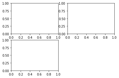
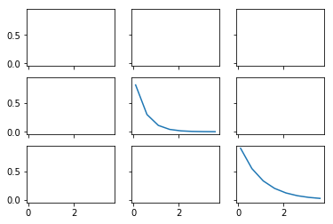
一个例子:plt.subplots方式
%matplotlib inline
x = np.arange(0.1, 4, 0.5)
y = np.exp(-x)
#快速创建图形 Fig 和 Axes Martix
fig, ax = plt.subplots(3, 3, sharex=True, sharey=True)
#或者使用 fig, ((ax1,ax2,ax3),(ax4,ax5,ax6),(ax7,ax8,ax9)) = plt.subplots(3,3)
print(ax)

# plot the linear_data on the 5th,8th subplot axes
ax[2][2].plot(x,y, '-')
ax[1][1].plot(x,y**2, '-')

# 对于一个包含多个轴的fig,可以使用 gcf().get_axis,或者直接对矩阵进行索引和操纵
for ax in plt.gcf().get_axes():
    for label in ax.get_xticklabels() + ax.get_yticklabels():
        label.set_visible(True)

# necessary on some systems to update the plot
plt.gcf().canvas.draw()
[[<matplotlib.axes._subplots.AxesSubplot object at 0x7ff0b4db0c18>
<matplotlib.axes._subplots.AxesSubplot object at 0x7ff0b4d6c1d0>
<matplotlib.axes._subplots.AxesSubplot object at 0x7ff0b4d835f8>]
[<matplotlib.axes._subplots.AxesSubplot object at 0x7ff0b4d9b9e8>
<matplotlib.axes._subplots.AxesSubplot object at 0x7ff0b4d35dd8>
<matplotlib.axes._subplots.AxesSubplot object at 0x7ff0b4d51208>]
[<matplotlib.axes._subplots.AxesSubplot object at 0x7ff0b4cea5f8>
<matplotlib.axes._subplots.AxesSubplot object at 0x7ff0b4d039e8>
<matplotlib.axes._subplots.AxesSubplot object at 0x7ff0b4f5b0f0>]]
2.3 绘图常用方法
2.3.1 Firure常用方法
Figure.subplots_adjust等同于调用subplots_adjust(left=None, bottom=None, right=None, top=None,wspace=None, hspace=None)顶级函数,用于调整子plot周围宽度、高度等表现形式。Figure.savefig(fname,dpi,bbox_inches,format)保存图像
2.3.2 Axes常用方法
- hist 柱状图/pie 饼状图/box 箱型图等等
- plot 如果不指定图的类型,比如饼状图或者柱状图,直接传入plot,参数填为data即可。
- add_patch 添加图形
- annotate 添加箭头
- text 添加文本说明
- get(set)_x(y)lim 获得/设置不同轴的范围
- g/s_(x/y)ticks 设置刻度位置 #plt.xticks((0,1,2),("a","b","c")) 可以快速指定位置和标签值。
- g/s_(x/y)ticklabels 设置刻度标签
- g/s_(x/y)label 设置轴名称
- title 题头设置
- legend 图例设置
对于Axes调用get/set等很多方法,其实也可以直接调用plt全局对象,不过调用axes单个元素可以获得更精细的控制,并且更面向对象一些。
fig.subplots_adjust(left=None, bottom=None, right=None, top=None,wspace=0, hspace=0)
#也可以使用plt顶级函数
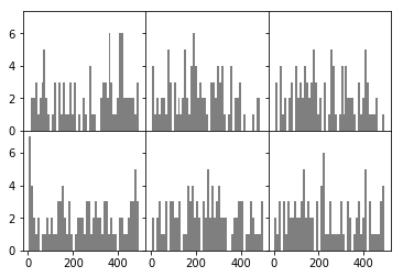
#histogram 柱状图
ax[0,0].hist(np.random.randint(1,500,size=100),bins=50,color="k",alpha=0.5)
ax[0,1].hist(np.random.randint(1,500,size=100),bins=50,color="k",alpha=0.5)
ax[0,2].hist(np.random.randint(1,500,size=100),bins=50,color="k",alpha=0.5)
ax[1,0].hist(np.random.randint(1,500,size=100),bins=50,color="k",alpha=0.5)
ax[1,1].hist(np.random.randint(1,500,size=100),bins=50,color="k",alpha=0.5)
ax[1,2].hist(np.random.randint(1,500,size=100),bins=50,color="k",alpha=0.5)
fig
#fig.savefig("hello.png",format="png",dpi=100,bbox_inches="tight")
#两个较为重要的参数是bbox_inches控制边距,第二个是dpi控制精度
ax[0,0].get_xlim() #ax有很多类型的图表,还有很多关于图形的方法。
plt.close("all")
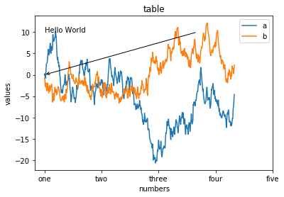
fig,ax = plt.subplots()
ax.plot(np.random.randn(500).cumsum(),label="a")
#此处设置plot的label值,即可以调用legend时自动生成图例。
ax.plot(np.random.randn(500).cumsum(),label="b")
ax.set_xticks([0,150,300,450,600])
ax.set_xticklabels(["one","two","three","four","five","six"]) #自动跳过了six
#也可以直接写ax.xticks([真实数值],[对应标签名称])
ax.set_title("table",loc="center")
ax.set_xlabel("numbers")
ax.set_ylabel("values")
ax.legend(loc="best") #legend图例,在plot时传入label进行创建
ax.text(0,10,"Hello World")
# matplotlib.pyplot.text(x, y, s, fontdict=None, withdash=False, **kwargs)
ax.annotate("",
            xy=(0, 0), xycoords='data',
            xytext=(400,10), textcoords='data',
            arrowprops=dict(arrowstyle="->",
                            connectionstyle="arc3"),
            )
Text(400,10,'')
plt.close("all")
2.3.3 SPINES坐标系绘制
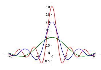
一个笛卡尔坐标系的设置:
%matplotlib inline
fig ,ax = plt.subplots()
x = np.arange(-2*np.pi,2*np.pi,0.01)
y = np.sin(3*x)/x
y2 = np.sin(2*x)/x
y3 = np.sin(x)/x

ax.plot(x,y,"r")
ax.plot(x,y2,"b")
ax.plot(x,y3,"g")

print(plt.gca(),ax)
# AxesSubplot(0.125,0.125;0.775x0.755) AxesSubplot(0.125,0.125;0.775x0.755)

ax.spines["right"].set_visible(False)
#class matplotlib.spines.Spine(axes, spine_type, path, **kwargs)
ax.spines["top"].set_visible(False)
ax.spines["bottom"].set_position(("data",0))
ax.spines["left"].set_position(("data",0))
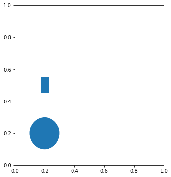
2.3.4 PATCH图形的绘制
图形绘制需要调用axes.add_patch()方法,传入参数为图形,也就是line/path/patches对象。和Qt图形绘制很类似,底层API。
import matplotlib.path as mpath
import matplotlib.patches as mpatches
fig = plt.figure(figsize=(12,6))
axes = fig.add_subplot(1,2,1)
grid = np.mgrid[0.2:0.8:3j, 0.2:0.8:3j].reshape(2, -1).T
patches = []
# add a circle
circle = mpatches.Circle(grid[0], 0.1, ec="none")
patches.append(circle)
# add a rectangle
rect = mpatches.Rectangle(grid[1] - [0.025, 0.05], 0.05, 0.1, ec="none")
patches.append(rect)
axes.add_patch(patches[0]);axes.add_patch(patches[1])
<matplotlib.patches.Rectangle at 0xaa66e76a58>
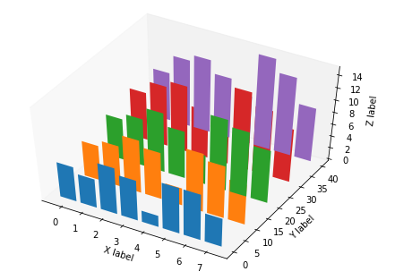
2.3.5 AXES3D图表绘制
from mpl_toolkits.mplot3d import Axes3D

x = np.arange(8)#生成数据
y = np.random.randint(0,10,8)
y2 = y + np.random.randint(0,3,8)
y3 = y2 + np.random.randint(0,3,8)
y4 = y3 + np.random.randint(0,3,8)
y5 = y4 + np.random.randint(0,3,8)

fig = plt.figure() ; ax = Axes3D(fig) #普通方法调用fig和ax
#或者采用ax = fig.add_subplot(111, projection='3d')绘制子图形。
# For those using older versions of matplotlib,
#change ax = fig.add_subplot(111, projection='3d') to ax = Axes3D(fig).

ax.bar(x,y,0,zdir="y")#数据和作为第三轴的轴:y
ax.bar(x,y2,10,zdir="y")
ax.bar(x,y3,20,zdir="y")
ax.bar(x,y4,30,zdir="y")
ax.bar(x,y5,40,zdir="y")
ax.set_xlabel("X label")#标签
ax.set_ylabel("Y label")
ax.set_zlabel("Z label")
ax.view_init(elev=50)#视角
ax.grid(False)
#3D设置在class mpl_toolkits.mplot3d.axes3d.Axes3D(fig, rect=None, *args, **kwargs)
2.3.6 子图网格和多面板绘图
区别与fig.add_subplot(),使用fig.add_axes()方法手动创建一个新的Axes,但是并没有制定该Axes的位置,需要手动指定,一般用作附属图形的绘制,之后调用此子axes,就可以对附属图形进行绘制了。
fig = plt.figure()
ax_1 = fig.add_axes([0.1,0.1,1,1]) #此处定义的是图表的 rect [left, bottom, width, height]
ax_2= fig.add_axes([0.7,0.7,0.3,0.3])
ax_1.plot(np.random.randint(0,10,50),"ro")
ax_2.plot(np.random.randint(0,10,3),"g--")
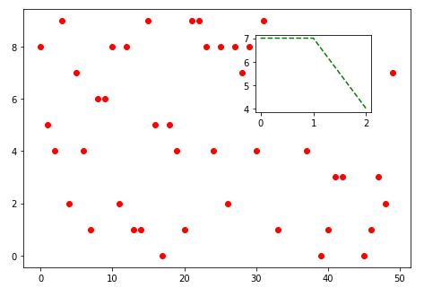
类似于:
fig,ax = plt.subplots(1,1)
ax_sub = fig.add_axes([0.7,0.7,0.3,0.3])
ax_sub.plot(np.random.randint(0,10,50),"ro")
ax.plot(np.random.randint(0,10,3),"g--")
不过,第一种方式看起来更清晰,创建空Figure,使用add_axes创建两个subplot的axes。第二种则含混很多,创建Figure和一个总的Axes,然后使用add_subplot创建subplot和子axes。
在前面add_subplot()的介绍中,可以在此定义“12X”表示水平划分1个,垂直划分2个,选取第X个。但是,为了精确控制位置,可以使用GridSpec对象,传入一个方格大小,然后对其进行切片调用,作为参数传递给add_subplot(),这样就可以进行精细的子图控制。
fig =` plt.figure()
gs = plt.GridSpec(3,3) #新建一个网格
fig.add_subplot(gs[1,:2]).plot(np.random.randint(0,10,10),"o") #不再传入1,2,1,而是传入
s2 = fig.add_subplot(gs[0,:2])
s2.plot(np.random.randint(0,10,10),"o")
fig.add_subplot(gs[2,0]).plot(np.random.randint(0,10,10),"o")
fig.add_subplot(gs[:2,2]).plot(np.random.randint(0,10,10),"o")
fig.a`dd_subplot(gs[2,1:]).plot(np.random.randint(0,10,10),"o")
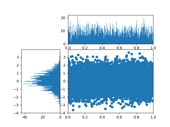
下面是一个应用Gridspec的例子:
from matplotlib.gridspec import GridSpec
import numpy as np
fig = plt.figure()
gs = GridSpec(3,3)
main = fig.add_subplot(gs[1:,1:])
hist = fig.add_subplot(gs[1:,0:1])
hist_x = fig.add_subplot(gs[0:1,1:])

data_x = np.random.random(size=10000)
data_y = np.random.normal(size=10000)

main.scatter(data_x,data_y)
main.set_xlim(0,1)
hist.hist(data_y,orientation='horizontal',bins=1000) #水平显示
hist.invert_xaxis() #反转X轴以方便比较数据
hist_x.hist(data_x,bins=1000)
hist_x.set_xlim(0,1)
2.3.7 GCA高级用法
使用plt.gca()可以精细控制绘图,比如:
plt.gca().fill_between(x,y1,y2,alpha,color)
可以绘制两条曲线组成的填充图形,在表示面积的时候很有用,比如积分面积。此外,还可以这样使用:
xaxis = plt.gca().get_xaxis() #从AXES实例中获取XAXIS实例

for item in xaxis.get_ticklabels(): #从XAXIS实例中获取TICKLABELS
    item.set_alpha(1) #TICKLABELS由TEXT实例构成,TEXT实例有很多方法
    item.set_rotation(45)
    item.set_backgroundcolor('r')
    item.set_color('w')
gca()本质上是一个Axes对象,查阅文档可以看出,这个对象具有很多可用的方法,比如本例中取出x子轴,并且对此轴的刻度标签进行遍历(Text对象),设置旋转、透明度和颜色、背景,对于较长的时间日期,这样可以使得坐标轴文字不挤在一起。
2.4 RC全局样式
matplotlib可以对plt.rc进行设置,所有通过plt接口调用的API都会按照此设置进行处理。可以使用plt.rcdefaults()来回复默认设置。plt.rc一般传入一个字典作为参数,如下所示:
font_set = {
    "family":"Vera",
    "size":10
}
#plt.rc("font",**font_set)
plt.rcdefaults()
matplotlib.matplotlib_fname()
'c:\\python\\python36\\lib\\site-packages\\matplotlib\\mpl-data\\matplotlibrc'
2.5 优秀的图表要素
一个优秀的图表,起码在最近5年,需要满足以下价值观:
- 准确和精确
- 功能优先
- 尽量美观
- 整合数据,并且试图表述某些观点,具有启发性。
以下是一个例子:
plt.close()
import matplotlib.pyplot as plt
import numpy as np

plt.figure()

languages =['Python', 'SQL', 'Java', 'C++', 'JavaScript']
pos = np.arange(len(languages))

color = "lightslategray"
bars = plt.bar(pos, popularity, align='center',color=color)
bars[0].set_color("#1F77B4")

plt.xticks(pos, languages,alpha=0.7)
plt.ylabel('% Popularity',alpha=0.7)
plt.title('Top 5 Languages for Math & Data \nby % popularity on Stack Overflow')

plt.tick_params(direction='in',top=False, bottom=False, left=False,
                right=False, labelleft=False, labelbottom=True)

# remove the frame of the chart
for spine in plt.gca().spines.values():
    spine.set_visible(False)

#bars #BarContainer object of 5 artists
for bar in bars:
    plt.gca().text(bar.get_x()+bar.get_width()/2,
                bar.get_height()-5,
                str(bar.get_height())+"%",color="w",ha='center')

plt.show()
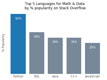
这个例子做了什么?将不必要的刻度省略,删除坐标轴,添加每个项目的比例说明,突出重点项目,淡化相似项目,不重要的部分采用半透明显示。注意这个例子中,是如何对bars : matplotlib.container.BarContainer 进行遍历,并且根据bar.get_height()等属性放置文字并显示的。还应该注意,plt.gca().spines.values()的遍历,之前的笛卡尔坐标系,其实就是操纵这个东西,Spine属于Bases: matplotlib.patches.Patch对象,Spines取出来大概是这个样子,因此可以使用spines["left"].set_visible(False)进行隐藏。
plt.gca().spines

OrderedDict([('left', <matplotlib.spines.Spine at 0x7fb03f0b2898>),
            ('right', <matplotlib.spines.Spine at 0x7fb03f0b2518>),
            ('bottom', <matplotlib.spines.Spine at 0x7fb03f0b2cf8>),
            ('top', <matplotlib.spines.Spine at 0x7fb03f0b2198>)])
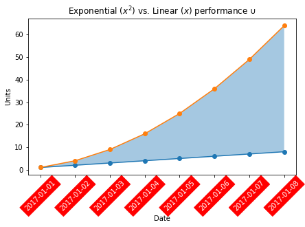
import matplotlib as mpl
import matplotlib.pyplot as plt
plt.figure(figsize=(10,7))
plt.plot([1,2,3],[2,.3,4])
plt.plot(range(len(aggdata2.columns)),aggdata2.loc["TMAX"],'-',
        color="pink",label="AVG High temp")
plt.plot(range(len(aggdata2.columns)),aggdata2.loc["TMIN"],'-',
        color="lightblue",label="AVG Low temp")
plt.fill_between(range(len(aggdata2.columns)),aggdata2.loc["TMIN"],
        aggdata2.loc["TMAX"],color="gray",alpha=0.1)
plt.scatter(range(len(aggdata2.columns)),df15n.loc["TMAX"],
        color="pink",alpha=0.8,label = "2015 High temp")
plt.scatter(range(len(aggdata2.columns)),df15n.loc["TMIN"],
        color="lightblue",alpha=0.8,label = "2015 Low temp")

plt.xticks(xlist,"January February March April May June \
    July August September October November December".split(" "),alpha=0.8)
plt.yticks([150,200,250,300,350,400],[15,20,25,30,35,40],alpha=0.8)
plt.ylim((100,420))
plt.legend(frameon=False,loc=1)

for text in plt.gca().get_xaxis().get_ticklabels():
    text.set_rotation(30)
plt.grid(color="silver")
plt.tick_params(bottom=False,left=False)
plt.gca().spines["right"].set_visible(False)
plt.gca().spines["top"].set_visible(False)
plt.title("2015 temperature and calendar year temperature comparison (°C)\n")
plt.ylabel("Temperature (°C)",alpha=0.8)
plt.text(0,110,"The shadow indicates the average temperature change in 2005-2014",alpha=0.5)
plt.savefig("output.png",dpi=300)
一个还算不错的DEMO,图反映了东南亚2015年每天的天气和最近10年平均天气的对比,可以看出高温过多,而低温相近。
3. pandas内置绘图函数
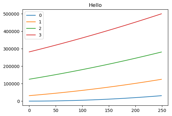
3.1 线型图line
df1 = DataFrame(np.arange(1000).cumsum().reshape(4,250))
df1 = df1.T
df1.plot(kind="line",title="Hello",figsize=(6,4))
#一般来说,plot内含有一个kind定义图标类型,一个figsize定义大小,
#一个title定义标题,一个legend定义图例,xticks和yticks等,返回一个axes对象
#ax参数可以传递一个定义好的axes,xlim/ylim定义界限、xticks定义刻度值、
3.2 柱状图bar/barh
fig, axes = plt.subplots(2, 1)
data = pd.Series(np.random.rand(16), index=list('abcdefghijklmnop'))
data.plot.bar(ax=axes[0], color='k', alpha=0.7)
data.plot.barh(ax=axes[1], color='k', alpha=0.7)
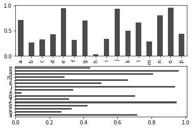
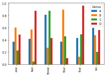
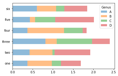
需要注意,柱状图要绘制多个图,并且共享一个x轴,一般来讲,最好将这些需要重复绘制的项放在column index下(如下),否则就要手动控制plt,多次调用plot,然后每次绘制x轴偏移一定的距离(很麻烦)。
df = pd.DataFrame(np.random.rand(6, 4),
                  index=['one', 'two', 'three', 'four', 'five', 'six'],
                  columns=pd.Index(['A', 'B', 'C', 'D'], name='Genus'))
df
df.plot.bar()
df.plot.barh(stacked=True, alpha=0.5)
plt.close('all')
3.3 散点图scatter
利用颜色
np.random.seed(123)

df = pd.DataFrame({'A': np.random.randn(365).cumsum(0),
                   'B': np.random.randn(365).cumsum(0) + 20,
                   'C': np.random.randn(365).cumsum(0) - 20},
                  index=pd.date_range('1/1/2017', periods=365))


plt.style.use("seaborn")
df.plot.scatter(x='A',y='B',c=df["C"],colormap="viridis")
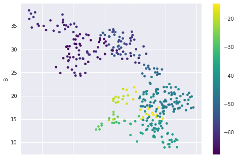
下面这个例子来自于SVM机器学习,可以看到如何用可视化来区分不同的点。
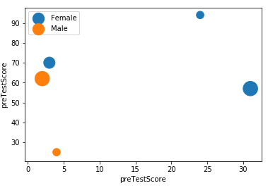
点的大小
对于以下数据集,可以作图,注意这里做了两次的图,因为label标签只能表示一个数据,因此我们需要表示两个数据,就要画两次。这两次的点可能重叠,最好使用半透明alpha。最后,记得要打开legend,否则图例不会显示。
    first_name	last_name	age	female	preTestScore	postTestScore
0	Jason	Miller	42	0	4	25
1	Molly	Jacobson	52	1	24	94
2	Tina	Ali	36	1	31	57
3	Jack	Milner	24	0	2	62
4	Amy	Cooze	73	1	3	70

plt.scatter(data[data.female == 1].preTestScore,
data[data.female == 1].postTestScore,s=data.postTestScore*4.5,label="Female",alpha=0.9)

plt.scatter(data[data.female != 1].preTestScore,
data[data.female != 1].postTestScore,s=data.postTestScore*4.5,label="Male",alpha=0.9)
plt.legend(loc=2)
plt.xlabel("preTestScore")
plt.ylabel("preTestScore")
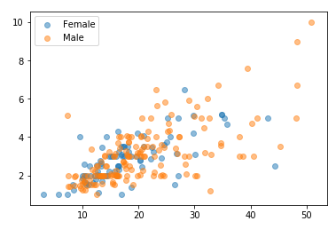
另外一个例子的图如下,这里的技巧是使用了50%的半透明,因此数据可以很好的区分。
3.4 其他图类
比如像 plot.pie() 为饼图,接受一个size list,还有对应的labels list, plot.hist() 为概率分布图(不要和bar搞混)。plot.boxplot() 为箱图。boxplot接受一个[alist,blist],分别绘制在x轴的两个类别中,每个list表示一箱。
pandas内置的绘图基本上都是调用matplotlib,不过做了一定的整合,绘制起来较为方便,但是不够灵活。通过DF/S.plot即可绘制。对于plot.bar()这样可以类似于axes.bar()这样指定类型。pandans对于图像可视化章节有详细的示例,因此在此不再展开。对于matplotlib,官方提供了很多绘图自定类,通过组合底层API,可以绘制不同样式的图,详情参考matplotlib的示例库,真的很漂亮。
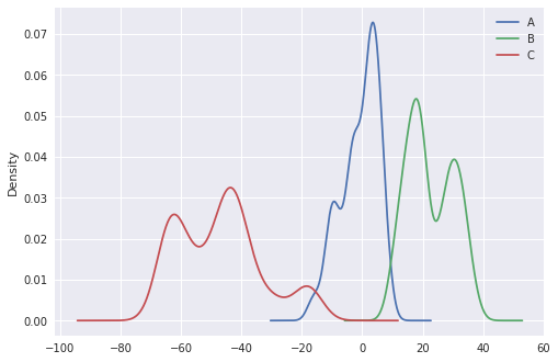
kde 图表
df.plot.kde() 这个函数很方便,在pandas中你甚至不用添加任何参数...就可以得到:
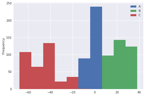
hist 图表
df.plot.hist() 同理
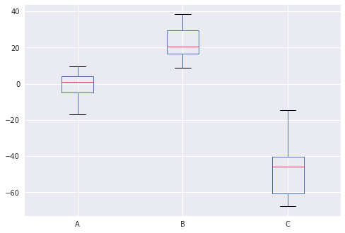
box 图表
df.plot.box() 同理
4. Matplotlib 内置图类
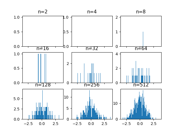
4.1 Histograms 频率图
这种图表的特点是,X轴为分类变量或者连续变量,Y轴为其出现的频次。一般,各种分布曲线都使用Hist()进行绘制和表示,比如正态分布是一条钟形的Hist频率分布曲线。
频率分布图的一个难点在于bins参数的选择,bins参数用来将X轴按照一定的尺度进行聚合。对于n=100的抽样,如果使用1000的bins,那么x轴就会被分为1000份进行计数,缺失值为0,这样就很难看出趋势。因此,选择合适的bins非常重要。
import numpy as np
fig, axeses = plt.subplots(3,3,sharex=True)
i = 0
for axes in axeses.flat:
    i += 1
    data = np.random.normal(size=2**i)
    axes.hist(data,bins=1000)
    axes.set_title('n=%d'%2**i)
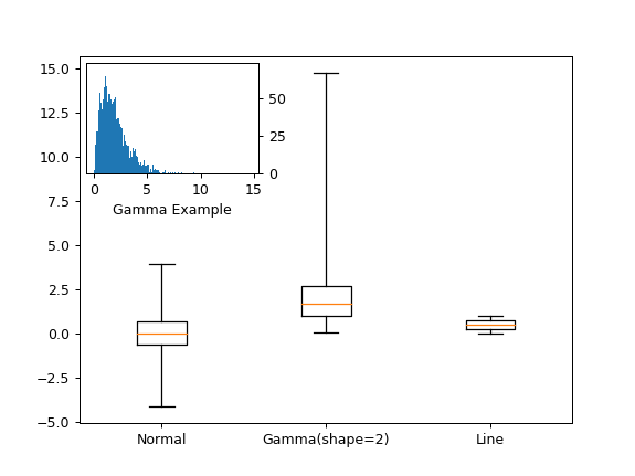
4.2 Box 箱图
箱图是一种很好的用来展示数据差异性的图表,不同于Hist和隐晦的std,Box使用的四分位距能够直观的显示数据分散程度。Box的一个要点在于晶须的选择,也就是 whis参数,这个参数用来过滤偏差较为大的离散点,以防止其干扰四分位距描述数据整体的能力。使用range作为其值可以强制使用全部的点。
import numpy as np
import pandas as pd
#inset_locator 是一个很方便的用以在内部绘制子图的类
#除了这种方法,其实还可以使用add_axes来添加
import mpl_toolkits.axes_grid1.inset_locator as mpl_il
n_data = np.random.normal(size=10000)
g_data = np.random.gamma(shape=2,size=10000)
l_data = np.random.random(size=10000)

plt.figure()
bp = plt.boxplot([n_data,g_data,l_data],whis='range',labels=['Normal','Gamma(shape=2)','Line'])
gamma_axes = mpl_il.inset_axes(plt.gca(),width='35%',height='30%',loc=2)
gamma_axes.yaxis.tick_right()
gamma_axes.set_xlabel('Gamma Example')
_= gamma_axes.hist(g_data,bins=1000)
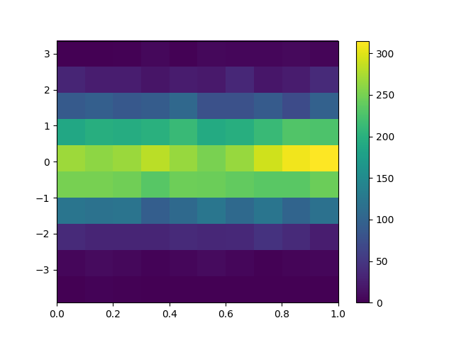
4.3 HeatMaps
热图指的是一种形式的频率分布图,这种图形对于X轴为连续变量的类型表现很好,至于X轴是分类变量,则推荐使用hist。热图使用hist2d函数。同样的,其有bins参数的选择问题。
plt.figure()
plt.hist2d(np.random.random(size=10000),
        np.random.normal(size=10000),
        bins = 10)
plt.colorbar() #用以添加一个类似于图例的指示条。
4.4 动画
所有的动画从属于mpl.animation类。
import matplotlib.animation as animation
x = np.random.randn(100)

def update(index):
    if index == 100:
        a.event_source.stop()
        #停止动画
    plt.cla() #清除当前Axes
    #plt.hist(x[:index],bins=np.arange(-4,4,0.5))
    plt.hist2d(x[:index])
    plt.axis([-4,4,0,30])
    plt.gca().set_title('Simple Normal Distribution')
    plt.gca().set_ylabel('Frequency')
    plt.gca().set_xlabel('Value')
    plt.annotate('n = {}'.format(index),[0,0])

fig = plt.figure()
#通过FuncAnimation运行
a = animation.FuncAnimation(fig,update,interval=100)
#a.save('demo.html')
4.5 交互
fig = plt.figure()
data = np.random.rand(100)
data2 = np.random.rand(100)
plt.scatter(data,data2)

def onclick(event):
    plt.cla()
    plt.scatter(data,data2)
    plt.gca().set_title('You clicked {},{}'.format(event.x,event.y))
    plt.gca().annotate('data is {} and {}'.format(event.xdata,event.ydata),[0,0])

plt.gcf().canvas.mpl_connect('button_press_event',onclick)
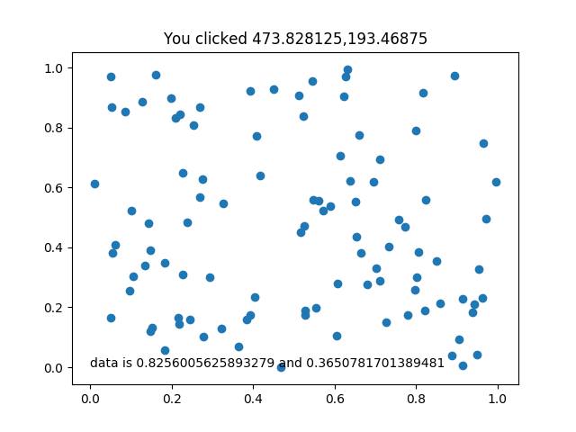
以下是一个交互的例子:
import pandas as pd
import numpy as np
import matplotlib.pyplot as plt

np.random.seed(12345)
df = pd.DataFrame([np.random.normal(32000,200000,3650),
                   np.random.normal(43000,100000,3650),
                   np.random.normal(43500,140000,3650),
                   np.random.normal(48000,70000,3650)],
                  index=[1992,1993,1994,1995])

from scipy.stats import norm
import matplotlib as mpl

y_err = (df.std(1)/(np.sqrt(df.shape[1]))) * norm.ppf(0.95)

coffs = list(norm.interval(0.95 ,loc = loc, scale = scale)
            for (loc, scale)
            in zip(df.mean(1),df.std(1)/np.sqrt(df.shape[1])))

def prob_once(b,coffs):

    def prob_pre(a,coff):

        if a < coff[0]: return 1
        elif a > coff[1]: return 0
        else: return (coff[1] - a)/(coff[1]-coff[0])

    return [prob_pre(b,coff) for coff in coffs]


tmap = mpl.cm.ScalarMappable(mpl.colors.Normalize(vmin=0,vmax=1),
                        mpl.cm.get_cmap('RdYlGn'))
tmap.set_array([])

%matplotlib notebook

fig = plt.figure()

ax=(plt.bar(range(len(df.index)),df.mean(axis=1),width=0.97,
    tick_label=["1992","1993","1994","1995"],color="gray",
    yerr=y_err,align="center",
    error_kw={"capsize":8,"elinewidth":2,"capthick":2}))
plt.tick_params(bottom=False)
plt.gca().set_xlim(-0.5,4)
plt.gca().spines["right"].set_visible(False)
plt.gca().spines["top"].set_visible(False)
plt.gca().set_title("Click somewhere on the figure to start")


def show_color(event):
    plt.cla()

    bars=(plt.bar(range(len(df.index)),df.mean(axis=1),
        width=0.97,tick_label=["1992","1993","1994","1995"],color="gray",
        yerr=y_err,align="center",
        error_kw={"capsize":8,"elinewidth":2,"capthick":2}))

    plt.tick_params(bottom=False)
    [plt.gca().spines[loc].set_visible(False) for loc in "right left top bottom".split(" ")]
    plt.gca().set_xlim(-0.5,4)

    plt.gca().annotate("%.2f"%event.ydata,xy=(3.5,event.ydata+1000),color="red")
    plt.axhline(y=event.ydata,color='r')

    for index,value in enumerate(prob_once(event.ydata,coffs)):
        bars[index].set_color(tmap.to_rgba(value))


plt.gcf().colorbar(tmap,orientation='horizontal')
plt.gcf().canvas.mpl_connect("button_press_event",show_color)
#plt.gcf().canvas.mpl_connect("motion_notify_event",show_color)
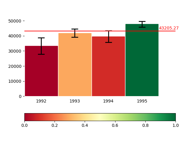
在这个例子中,对于观察到的分布,首先对其进行标准差和err的计算,然后绘制图案。由于分布概率是一个很难直观展示的东西,因此这里采用了鼠标移动交互事件。图表会显示鼠标指的位置的各个年份的不同的值,然后判断在此条件下的可能性,由不同的颜色表示出来,可以使用colorbar进行对照。
这里的一个难点在于colormap的使用,第二个难点在于概率的计算。
————————————————————————————————————
更新日志
2018-02-28 完成《利用Python进行数据分析》阅读和笔记
2018-03-25 完成笔记补充和目录整理
2018-03-28 笔记补充和目录整理,添加了hist、pie、scatter表的说明。
2018-05-12 重新理解了Matplotlib的OOP部分,理清了全文的思路,重新进行了写作。
2018-05-15 更新了箱图、频率图、热图、动画和交互部分,修改了部分对于add_axes和add_subplots的陈述。
2018-05-17 添加了交互的一个例子,这个例子是华盛顿大学Coursera数据展示课程第三周的作业。
2018-05-23 补充了几个内置的pandas绘图函数。