
Python数据处理学习笔记 - seaborn统计数据可视化篇
Seaborn是基于Python的一个统计绘图工具包。Seaborn提供了一组高层次封装的matplotlib API接口。使用Seaborn而不是matplotlib,绘图只需要少数几行代码,并且可以更加容易控制Style、Palette。本文基本是按照官方Guide顺序写就的。
Seaborn的手册层次很清晰,Style、Plotting(按照离散、连续和描述数据分类)。本文提供一个概要型说明(对于API封装,尤其是一个为了简化之前API的封装,好用就够了)尚未提供一个深入其内部机制的说明,如果想要彻底控制绘图,请直接使用matplotlib,或者尝试在Seaborn的源代码中寻找答案。
约定俗称的,引入以下必要的Package。
import numpy as np
import pandas as pd
import matplotlib.pyplot as plt
import seaborn as sns
%matplotlib inline
1. STYLE
简单的对比一下使用matplotlib和Seaborn绘图的差异:
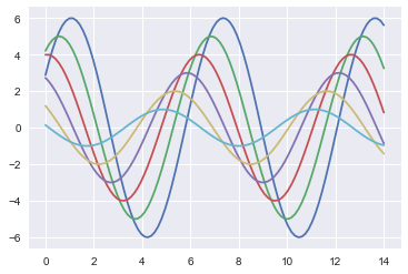
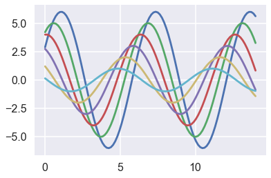
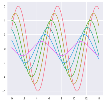
def sinplot(flip=1):
    x = np.linspace(0, 14, 100)
    for i in range(1, 7):
        plt.plot(x, np.sin(x + i * .5) * (7 - i) * flip)
sinplot()
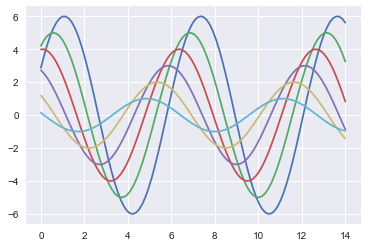
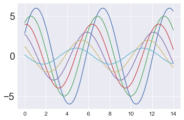
使用Seaborn绘图是一件面向过程的代码写作方式,必须在导入后就调用set()函数来设置一些基本变量。如果不调用set,plot()会默认使用原始的matplotlib方式进行绘图。
sns.set()
sinplot()
1.1 基本样式
sns用来控制style的方法有两组:
第一组定义一个style,然后set这个style。定义style采用 axes_style(),set style采用 set_style()。sns内置了一些主题: darkgrid, whitegrid, dark, white, and ticks。其分别代表暗格、白格、暗色、白色、有刻度的白色,你可以直接调用它们而不用自己再去详细设置其参数。
另外一个用来控制具体元素,比如字体大小、样式、粗细,使用 plot_context() 和 set_context()
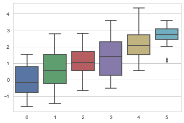
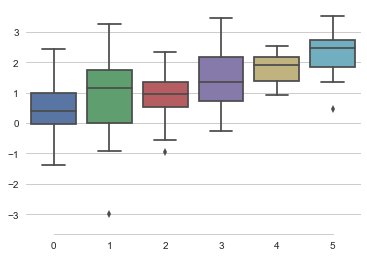
sns.set_style("whitegrid")
data = np.random.normal(size=(20, 6)) + np.arange(6) / 2
sns.boxplot(data=data);
axis_style 和 set_style
可以通过定义set_style()来定义style,全局的set()函数接受所有的matplotlib rc定义,但是set_style()只接受axes_style()提供的参数。
sns.axes_style()
{'axes.axisbelow': True,
 'axes.edgecolor': '.8',
 'axes.facecolor': 'white',
 'axes.grid': True,
 'axes.labelcolor': '.15',
 'axes.linewidth': 1.0,
 'figure.facecolor': 'white',
 'font.family': ['sans-serif'],
 'font.sans-serif': ['Arial',
  'DejaVu Sans',
  'Liberation Sans',
  'Bitstream Vera Sans',
  'sans-serif'],
 'grid.color': '.8',
 'grid.linestyle': '-',
 'image.cmap': 'rocket',
 'legend.frameon': False,
 'legend.numpoints': 1,
 'legend.scatterpoints': 1,
 'lines.solid_capstyle': 'round',
 'text.color': '.15',
 'xtick.color': '.15',
 'xtick.direction': 'out',
 'xtick.major.size': 0.0,
 'xtick.minor.size': 0.0,
 'ytick.color': '.15',
 'ytick.direction': 'out',
 'ytick.major.size': 0.0,
 'ytick.minor.size': 0.0}
在 axes_style(mystyledict)中应用自定义主题则直接作用于部分。在 set_style(mystyledict)中应用自定义主题则直接作用于整体。
在作用域范围内应用Style
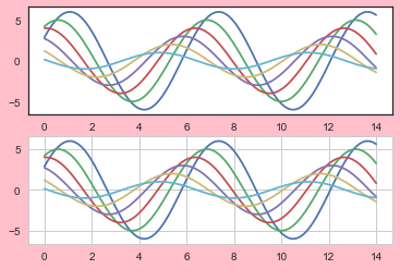
此外,可以在作用域范围内指定主题。
with sns.axes_style("white",rc={"grid.linestyle": '--', 'figure.facecolor': 'pink'}):
    plt.subplot(211)
    sinplot()
plt.subplot(212)
sinplot()
despine() 控制坐标轴
此外,可以使用despine(offset,trim)来控制不同样式的坐标轴。
data = np.random.normal(size=(20, 6)) + np.arange(6) / 2
sns.boxplot(data=data);
sns.despine(offset=10,trim=True,left=True) #offset离开坐标轴距离,trim刻度
set() 重置样式
通过调用set()可以初始化sns,也可以重置sns。在这里可以快速传入一些参数,比如fig.figsize
sns.set()
sns.set_context("poster") #有 paper、talk、notebook、poster可选
sinplot()
plotting_context()和set_context()
和axes_style 与 set_style()的关系一样,不仅仅可以用 set_content(),还可以用 plotting_context() 和 with语句来局部作用。
sns.plotting_context()
{'axes.labelsize': 17.6,
 'axes.titlesize': 19.200000000000003,
 'font.size': 19.200000000000003,
 'grid.linewidth': 1.6,
 'legend.fontsize': 16.0,
 'lines.linewidth': 2.8000000000000003,
 'lines.markeredgewidth': 0.0,
 'lines.markersize': 11.200000000000001,
 'patch.linewidth': 0.48,
 'xtick.labelsize': 16.0,
 'xtick.major.pad': 11.200000000000001,
 'xtick.major.width': 1.6,
 'xtick.minor.width': 0.8,
 'ytick.labelsize': 16.0,
 'ytick.major.pad': 11.200000000000001,
 'ytick.major.width': 1.6,
 'ytick.minor.width': 0.8}
set_context可以接受多个参数,所有字典类的写入rc参数.
sns.set_context("paper",font_scale=1.5,rc={'ytick.labelsize': 20.0})
sinplot()
1.2 调色板
sns.set(rc={"figure.figsize": (6, 6)})
颜色可以使用RGB tuples, hex color codes, or HTML color names表示。The return value is always a list of RGB tuples.
和设置Style类似,调色板的两个关键的函数是color_palette() 和 set_palette()
print(sns.color_palette())
sns.palplot(sns.color_palette())
#快速查看当前色板 deep, muted, pastel, bright, dark, and colorblind.
[(0.29803921568627451, 0.44705882352941179, 0.69019607843137254),
(0.33333333333333331, 0.6588235294117647, 0.40784313725490196),
(0.7686274509803922, 0.30588235294117649, 0.32156862745098042),
(0.50588235294117645, 0.44705882352941179, 0.69803921568627447),
(0.80000000000000004, 0.72549019607843135, 0.45490196078431372),
(0.39215686274509803, 0.70980392156862748, 0.80392156862745101)]

1.2.1 分类数据调色版
分类数据的两个常见已经定义的色板是 hls 和 hlus。这些可以直接调用,可也传递给其同名 palette 函数来进行更多的设置。此外还有 Pairs、Set1-3色板。
每个color_palette本质上都是包含几个元组的列表,你可以直接定义这些列表,或者参数调用相应函数传递色彩起始、返回、间隔、个数来定义 palette。或者使用 colorbrewer_palette 来通过GUI调用创建自己的色板。或者,直接调用颜色名称,放在一个列表中,使用set_palette()来构造自己的色版。
sns.palplot(sns.color_palette("hls", 9)) #调用hls系统色,长度为8.

或者采用 seaborn.hls_palette(n_colors=6, h=0.01, l=0.6, s=0.65)
颜色数目、第一个颜色起始值、亮度lightness、饱和度
sns.palplot(sns.hls_palette(10,0.3,0.8,1)) #h和l以及s的值在0和1之间

由于人类视觉系统的工作方式,会导致在RGB度量上强度一致的颜色在视觉中并不平衡。比如,我们黄色和绿色是相对较亮的颜色,而蓝色则相对较暗,使得这可能会成为与hls系统一致的一个问题。
为了解决这一问题,seaborn为husl系统提供了一个接口,这也使得选择均匀间隔的色彩变得更加容易,同时保持亮度和饱和度更加一致。此外,可以使用husl系统颜色。
sns.palplot(sns.color_palette("husl", 8))

此外,还有别的一些调色板
sns.palplot(sns.color_palette("Paired", 8)) #成对色板

sns.choose_colorbrewer_palette("s")
#一个gui交互部件,用来自定义选择颜色
# seaborn.choose_colorbrewer_palette(data_type, as_cmap=False)
#data_type : {‘sequential’, ‘diverging’, ‘qualitative’}
#如果你想返回一个变量当做颜色映射传入seaborn或matplotlib的函数中,可以设置as_cmap参数为True。
自定义色板
flatui = ["#9b59b6", "#3498db", "#95a5a6", "#e74c3c", "#34495e", "#2ecc71"]
sns.palplot(sns.color_palette(flatui))

1.2.2 连续数据调色板
你可以自己设置颜色,也可以使用内置色板。连续色常用色板有Blues、BuGn、GnBu等,这些色板也有其反转、更暗的色板。
除了直接调用,通过 light_palette()、dark_palette() 用来传递和设置更多的参数之外,还可以使用一个特殊的 cubehelix_palette() 通过参数/GUI 自定义自己的连续色板。
连续色板用来表示从那些不重要的数据到重要的数据之间的过渡。在matplotlib中的jet色板没有清楚的对其进行区分。
sns.palplot(sns.color_palette("Blues"))
sns.palplot(sns.color_palette("Blues_r")) #添加一个后缀就可以反转颜色
sns.palplot(sns.color_palette("Blues_d")) #添加一个后缀就可以更暗一点


此外,你也可以自己定义自己的色板。或者使用 light_palette 和 dark_palette("blue",revese=True)
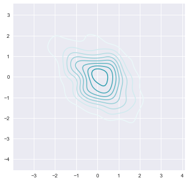
x, y = np.random.multivariate_normal([0, 0], [[1, -.5], [-.5, 1]], size=300).T
cmap = sns.cubehelix_palette(9,2.6,0.1,0.5,1,1,0.3, as_cmap=True)
pal = sns.dark_palette("yellow", as_cmap=True)
pal2 = sns.light_palette((210, 90, 60), input="husl",as_cmap=True)
pal2_nc = sns.light_palette((210, 90, 60), input="husl",as_cmap=False)
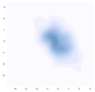
sns.kdeplot(x, y, cmap=pal2);
sns.palplot(pal2_nc)

除了这种直接调用颜色的方法之外,还可以使用 cubehelix_palette() 调节
seaborn.cubehelix_palette(n_colors=6, start=0, rot=0.4, gamma=1.0, hue=0.8, light=0.85, dark=0.15, reverse=False, as_cmap=False)
-
start float, 0 <= start <= 3
-
rot hue圆环的角度 float 似乎是颜色间隔
-
gamma值,0到1,越低表示越暗
-
hue : float, 0 <= hue <= 1 颜色饱和度
-
dark : float 0 <= dark <= 1 暗色加深
-
light : float 0 <= light <= 1 亮色加深
-
reverse : bool 反转色盘
Returns:palette or cmap 取决于你是否调用as_cmap
sns.palplot(sns.cubehelix_palette(6,0,0.4,0.5,0.8))
sns.kdeplot(x, y, cmap=cmap, shade=True);
同样的,使用GUI交互自己选择也是个好主意
sns.choose_cubehelix_palette()
1.2.3 离散数据调色板
如果你的数据中,数据并不是按照线性重要性进行递增的。那些离散的点的重要性可能更高,因此,这种情况下比较适合使用离散面板。
离散色的常用色板有 BrBG、RdBu 等Color Brewer离散颜色,还有matplotlib自带的 coolwarm 面板,还可以通过GUI/参数调用 diverging_palette() 定义自己的色板。
Color Brewer颜色字典里拥有一套精心挑选的离散颜色映射:
sns.palplot(sns.color_palette("BrBG", 7))
sns.palplot(sns.color_palette("RdBu_r", 7))


或者使用matplotlib的coolwarm面板,但是这个面板的区分度不强
sns.palplot(sns.color_palette("coolwarm", 7))

或者使用 diverging_palette() 来自定义面板,同样的,还有一个GUI工具:choose_diverging_palette()
sns.choose_diverging_palette()
seaborn.diverging_palette(h_neg,h_pos,s=75,l=50,sep=10,n=6,center='light',as_cmap=False)

h_neg, h_pos : float in [0, 359] 积极和消极颜色

    Anchor hues for negative and positive extents of the map.

s : float in [0, 100], optional 饱和度

    Anchor saturation for both extents of the map.

l : float in [0, 100], optional 亮度

    Anchor lightness for both extents of the map.

n : int, optional 颜色数量

    Number of colors in the palette (if not returning a cmap)

center : {“light”, “dark”}, optional 中心颜色明暗

    Whether the center of the palette is light or dark

as_cmap : bool, optional

    If true, return a matplotlib colormap object rather than a list of colors
sns.palplot(sns.diverging_palette(20,100,center="dark"))

The color_palette() function has a companion called set_palette() 和set_style以及axis_style()一样,可以作用于整体或者局部,或者直接作为cmap传递给plot。
sns.set_palette("husl")
sinplot()
with sns.color_palette("PuBuGn"):
    sinplot()
2. PLOTTING
2.1 分布数据集可视化
2.1.1 distplot()
from scipy import stats,integrate
sns.set(color_codes=True)
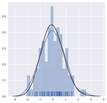
对于matplotlib来说,一般可以使用hist进行频率估计,使用kde进行核密度估计,然后绘制在两个axis,之后合并在一张fig上。
但是对于seaborn来说,使用 distplot 函数可以直接绘制rug(地毯图)、kde(核密度图)、hist(频率分布图),还可以指定bins,也就是估计点的取样范围。如果需要获得更大的控制力,可以分别使用kedplot()、rugplot()进行绘制,然后合并。
x = np.random.normal(size=100)
sns.distplot(x,rug=True,kde=True,bins=20,hist=True,fit=stats.gamma)
#可以使用fit参数将分布拟合到数据集,并可视化地评估其与观察数据的对应关系
<matplotlib.axes._subplots.AxesSubplot at 0x14512d79f28>
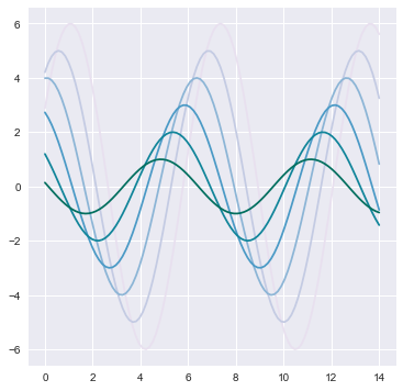
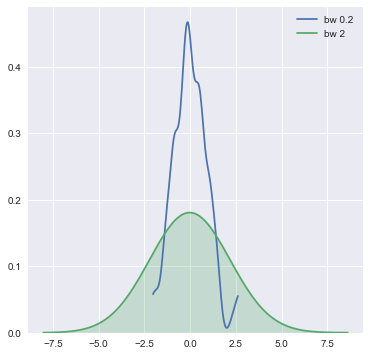
sns.kdeplot(x,bw=0.2,label="bw 0.2",cut=0)
#cut表示截取高斯KDE的部分,其不涉及分布,而是关于最大值和最小值的取值
sns.kdeplot(x,bw=2,label="bw 2",shade=True)
#bw控制带宽,和bins类似。shade表示绘制阴影。
<matplotlib.axes._subplots.AxesSubplot at 0x14512ca21d0>
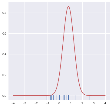
x = np.random.normal(0,1,size=30) #生成30个平均值为0,std为1的随机数。
bandwidth = 1.06*x.std()*x.size**(-1/5)
support = np.linspace(-4,4,200)
kernel = stats.norm(x[0],bandwidth).pdf(support)
#Probability density function at x of the given RV.
sns.rugplot(x)
plt.plot(support,kernel,c="r")
[<matplotlib.lines.Line2D at 0x14512effb38>]
2.1.2 JointGrid&PairGrid对象以及jointplot&pairplot函数
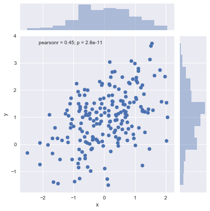
mean, cov = [0,1],[(1,0.5),(0.5,1)]
data = np.random.multivariate_normal(mean,cov,200)
df = pd.DataFrame(data,columns=["x","y"])
Jointplot kind和color参数的使用
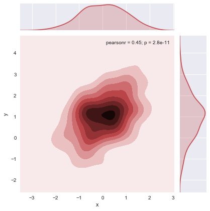
jointplot()用来进行双变量绘图,默认的scatter是一个很好的表示两个变量之间关系的方法。
sns.jointplot(x="x",y="y",data=df)#直接定义dataframe到data,然后定义x和y来源的column。
<seaborn.axisgrid.JointGrid at 0x14511b08128>
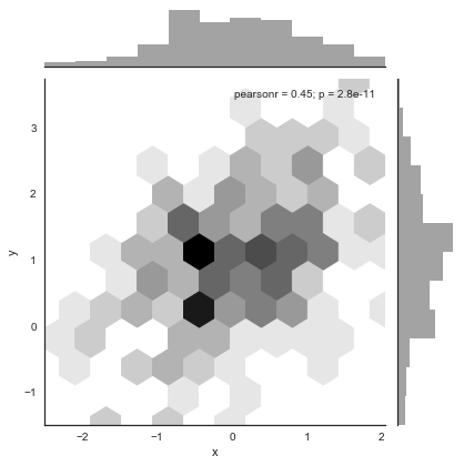
蜂巢图用来处理大量数据比较合适,注意color不能简写为c
with sns.axes_style("white"):#蜂巢图显示白色背景哼容易看清楚
    sns.jointplot(x=df.x,y=df.y,color="k",kind="hex")
sns.jointplot(x=df.x,y=df.y,color="r",kind="kde")
<seaborn.axisgrid.JointGrid at 0x14515073978>
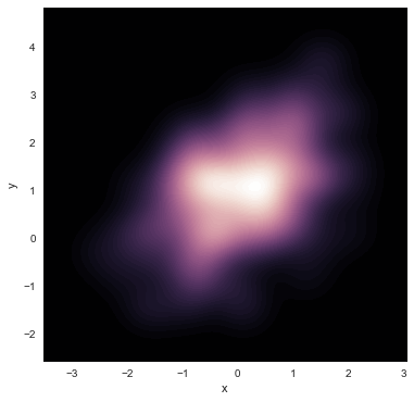
Jointplot n_levels和shade以及cmap参数的使用
如果想要表示kde的更多层级的话,使用n_levels即可。采用shade参数和cmap可以让数据更有表现力。
f, ax = plt.subplots(figsize=(6,6))
sns.kdeplot(df.x,df.y,ax=ax,n_levels=70,shade=True,
cmap=sns.cubehelix_palette(as_cmap=True,dark=1,light=0))
<matplotlib.axes._subplots.AxesSubplot at 0x14515554710>
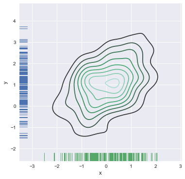
Jointplot 配合其他绘图函数,绘制在一张图上
当然,jointplot不能进行更为精细的控制,可以分别画kde和rug,下面展示了如何在一个ax上绘制多个图像。versical参数可以充分坐标轴。
f, ax = plt.subplots(figsize=(6,6))
sns.kdeplot(df.x,df.y,ax=ax)
sns.rugplot(df.x,color="g",ax=ax)
sns.rugplot(df.y,color="b",ax=ax,vertical=True)
<matplotlib.axes._subplots.AxesSubplot at 0x1451518da90>
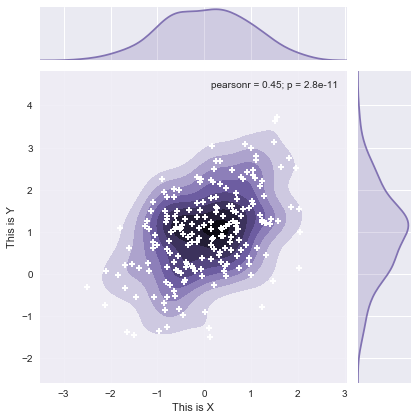
JointGrid对象操纵
jointplot()本身返回一个叫做JointGrid的对象,可以直接作用于这个对象来进行更精细的控制。
g = sns.jointplot(x=df.x,y=df.y,kind="kde",color="m")
g.plot_joint(plt.scatter,c="w",s=30,linewidth=2,marker="+")
g.ax_joint.collections[0].set_alpha(0.9)#主图形的alpha可以控制
g.set_axis_labels("This is X","This is Y")
<seaborn.axisgrid.JointGrid at 0x1451564a128>
g.ax_joint.__dict__
{'_adjustable': 'datalim',
 '_agg_filter': None,
 '_alpha': None,
 '_anchor': 'C',
 '_animated': False,
 '_aspect': 'auto',
 '_autoscaleXon': True,
 '_autoscaleYon': True,
 '_axes': <matplotlib.axes._subplots.AxesSubplot at 0x14515566cc0>,
 '_cachedRenderer': <matplotlib.backends.backend_agg.RendererAgg at 0x1451576fd68>,
 '_current_image': <matplotlib.collections.PathCollection at 0x1451571c518>,
 '_facecolor': '#EAEAF2',
 '_frameon': True,
 '_get_lines': <matplotlib.axes._base._process_plot_var_args at 0x145150732e8>,
 '_get_patches_for_fill': <matplotlib.axes._base._process_plot_var_args at 0x14515549f98>,
 'bbox': TransformedBbox(Bbox([[0.11072916666666667, 0.09944444444444456],
 [0.8226964285714286, 0.8207619047619048]]),
 BboxTransformTo(TransformedBbox(Bbox([[0.0, 0.0], [6.0, 6.0]]),
 Affine2D(array([[ 72.,   0.,   0.],
...
 'collections': [<matplotlib.collections.PathCollection at 0x1451571c668>,
  <matplotlib.collections.PathCollection at 0x14515740a58>,
  <matplotlib.collections.PathCollection at 0x14515740ef0>,
  <matplotlib.collections.PathCollection at 0x1451574d1d0>,
  <matplotlib.collections.PathCollection at 0x1451574d470>,
  <matplotlib.collections.PathCollection at 0x1451574d710>,
  <matplotlib.collections.PathCollection at 0x14515740780>,
  <matplotlib.collections.PathCollection at 0x145157403c8>,
  <matplotlib.collections.PathCollection at 0x14515738ba8>,
  <matplotlib.collections.PathCollection at 0x1451571c518>],
 'xaxis': <matplotlib.axis.XAxis at 0x145156683c8>,
 'yaxis': <matplotlib.axis.YAxis at 0x145155c0e48>}
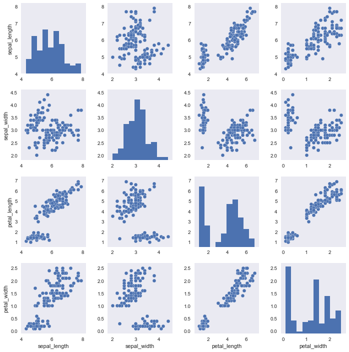
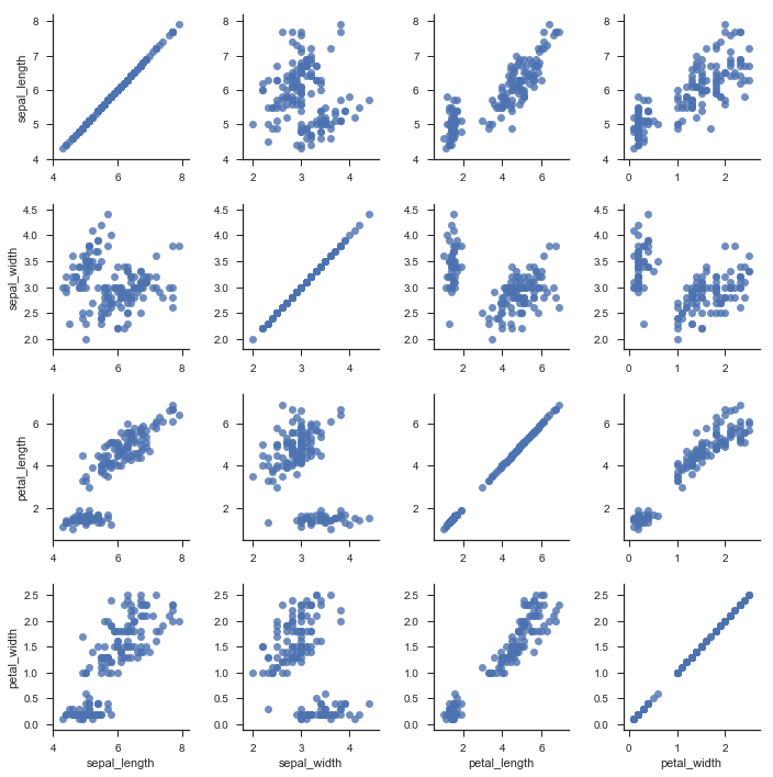
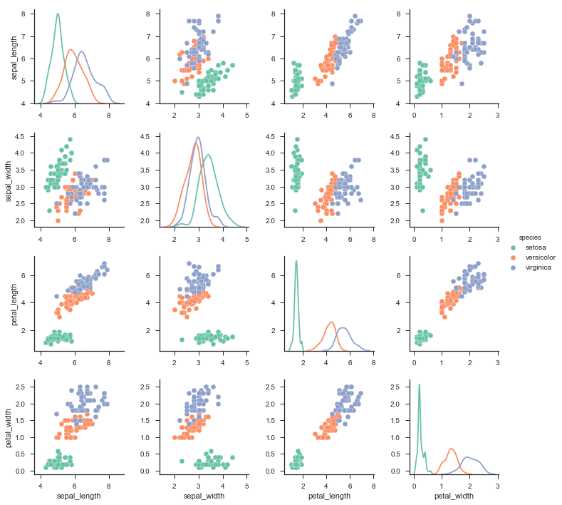
DataFrame和Pairplot的配合使用
iris = sns.load_dataset("iris")
print(iris.head())
   sepal_length  sepal_width  petal_length  petal_width species
0           5.1          3.5           1.4          0.2  setosa
1           4.9          3.0           1.4          0.2  setosa
2           4.7          3.2           1.3          0.2  setosa
3           4.6          3.1           1.5          0.2  setosa
4           5.0          3.6           1.4          0.2  setosa
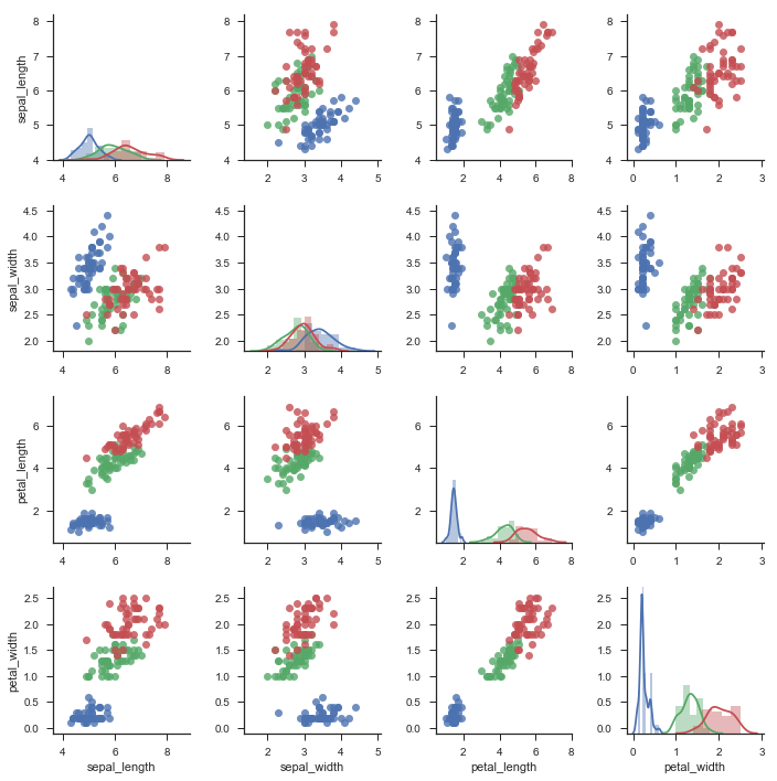
with sns.axes_style("dark"):
    sns.pairplot(iris)
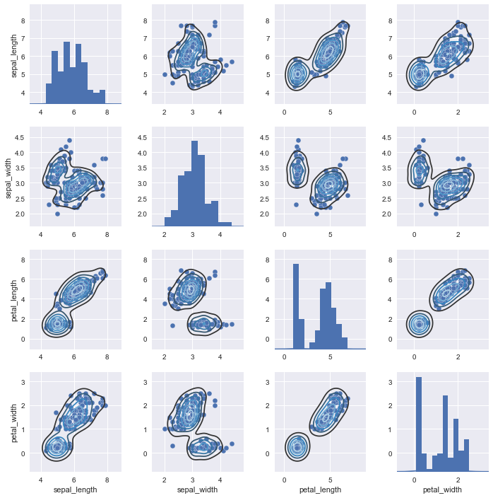
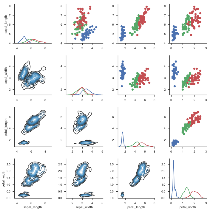
像JointGrid对象一样,pairplot有一个叫做PairGrid的对象,对它操作可以非常灵活的处理数据。
g = sns.pairplot(iris)
g.map_diag(sns.kdeplot)
g.map_offdiag(sns.kdeplot,cmap="Blues_d",n_levels=6)
<seaborn.axisgrid.PairGrid at 0x14516f82550>
2.2 分类数据集可视化
两个连续变量的关系可以用散点图和回归模型来表示,但是,对于分类数据,我们需要采用另外一种方式。这部分一共有以下三组函数,分别用来绘制分类数据散点图、基于类别的观测值分布、类别数据的统计估计。
-
swarmplot() & stripplot()
-
boxplot() & violinplot()
-
barplot() & pointplot()
这三个使用的范围如下:swarm和strip适用于较小数据集的差异表现,box和violin适用于较大数据集的差异表现,其中box采用四分位数的方法,更精确,violin则采用一个更加直观的方法。bar和point适合集中趋势表达,以及因变量也为分类变量的情况(而前四个函数则不适合这种情况,即自变量和因变量均为分类变量这种情况)。其中point更适合用于两个分类自变量在连续/分类但可加因变量水平上的交互作用表达。bar和point合起来可以更加清楚的在一张图上表达单个水平和交互作用。
titanic = sns.load_dataset("titanic")
tips = sns.load_dataset("tips")
iris = sns.load_dataset("iris")
sns.set(style="whitegrid")
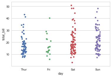
2.2.1 swarmplot()和stripplot()
这两个函数用来绘制几个分类变量和连续变量之间的关系,更多的用在表现在单一分类变量的轴上对应的连续变量分布密度和集中趋势。
常用的参数为 hue、jitter
stripplot()可以绘制分类数据的散点图,但是,过多的点会聚集在一处,因此需要使用 jitter 进行随机抖动,以显示在每一个分类数据中对应变量在某一点的集中/分布趋势。
sns.stripplot(x="day",y="total_bill",data=tips,jitter=True)
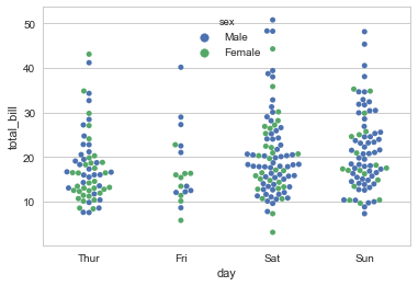
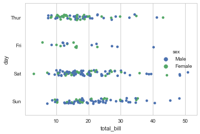
当然,也可以使用swarmplot()函数,此函数会使用内置的算法对数据进行抖动,保证点不会重合。 hux 参数可以用来在分类数据、对应的连续数据之外利用颜色区分另一组的分类变量。在很多请款下,这是很有用的。
对于strippolot()来说,两个分类数据加上一个连续观测值尽管使用jitter,还是会很乱,因此推荐使用swarmplot()函数进行绘制。
sns.swarmplot(x="day",y="total_bill",data=tips,hue="sex")
当然,你也可以更改方向以更加清楚的表示你想要表示的内容。
sns.stripplot(y="day",x="total_bill",data=tips,jitter=True,hue="sex")
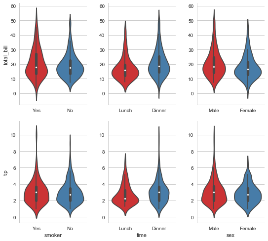
2.2.2 boxplot()和violinplot()
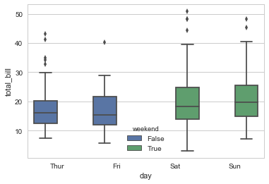
这两个函数用来表示无损的观测分布信息。因为在swarmplot和stripplot中尽管可以依稀看出在连续变量纬度的每个值处的分布密度,但是并不能给人一个清晰的印象(没有一个清楚地分界)。因此,采用boxplot()来表示三个四分位数和极值是一个好主意。
如下图所示,箱子表示从第一个四分位数到第三个四分位数,而两个晶须则表示极端值。
tips["weekend"] = tips.day.isin(["Sat","Sun"])
sns.boxplot(x=tips.day,y=tips.total_bill,hue=tips.weekend)
除了箱图,第二个可选的图案是提琴图。
sns.violinplot(x=tips.total_bill,y=tips.day,hue=tips.sex,bw=0.2)
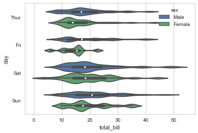
提琴图有些很有用的参数,比如bw表示核密度估计的估计带宽。提琴图是一种进化版本的strpplot或者swarmplot,其适合表示大规模数据,同时也不想箱图那样精确和不近人情。
其重要参数有:
-
bw kde带宽
-
split 对于次级分类变量在第一个主要分类变量轴上的合并。当这个次级分类变量不是很重要时,可以设为True。如果我们想要单独比较每个次级变量和连续变量的关系,最好采用False。
-
inner = "stick" 可以设置每个人的观察结果而不是进行汇总。
-
palette 设置调色板。对于任何函数基本上都可以调用这个参数进行函数级别的色彩调整。
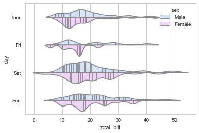
sns.violinplot(x=tips.total_bill,y=tips.day,hue=tips.sex,bw=0.2,split=True,
               inner="stick",palette=sns.hls_palette(5,0.6,0.9,1))
2.2.3 barplot()和pointplot()
最后,我们有时并不想要知道每个类别中的分布趋势,而是希望知道值的集中趋势。最简单的是barplot(),类似于matplotlib中的bar()/barh().
使用bar/pointplot()的另外一个原因是,对于自变量和因变量均为分类数据的情况而言,使用提琴图、箱图将都不会起作用,因为因变量只有两个点,而对这种数据进行绘制,则必须使用bar/pointplot()来做到对在不同自变量水平的二分分类因变量进行统计。
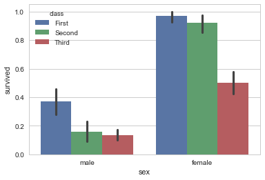
barplot()会自动估算最大值的置信区间并且使用误差条。
sns.barplot(x=titanic.sex,y=titanic.survived,hue=titanic["class"])
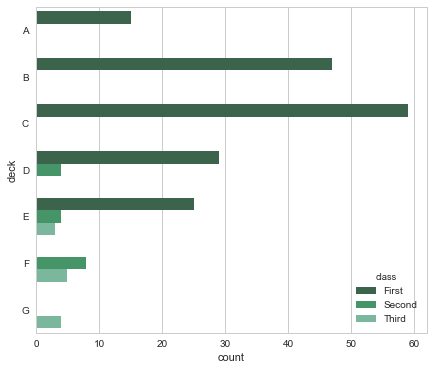
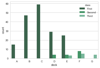
有时候,我们需要对分类变量进行计数,而不是和另外一个连续变量进行比较,这时候,可以使用countplot,注意,它和连续变量一节中的distplot()有点类似。
还有一些小细节我们需要提到,比如,使用x轴还是y轴绘制图像?在这个例子中,我们希望次啊用x轴表示计数,y轴表示甲板和乘客级别,这部分是因为自然设计的原因,水平面的变化更能吸引我们的注意力,而垂直的力度则小很多。这也是本图表想要表达的,试着比较一下下面两个表达内容的侧重:
f, ax = plt.subplots(figsize=(7,6))
sns.countplot(y=titanic.deck,palette="BuGn_d",hue=titanic["class"])
sns.countplot(x=titanic.deck,palette="BuGn_d",hue=titanic["class"])
点图是一个简化的条形图,其保留了相同多的信息,包含置信区间。不过,得益于斜率的变化,其主要用于表达两个分类变量之间在连续变量维度的相互作用的关系。
比如下面这个图,很详尽的表现了不同class和不同性别之间的交互,当然,以class为主。而对于下下面这个图,交互则以sex为主。可以看到问题所在,我们只能够清楚地描绘一个维度的变化,在这种情况下,第二个维度将会晦涩难懂,比如性别之于图1的变化和class之于图2的变化。(其实图2更糟糕一些,因为其class水平有三个,而sex水平有两个,因此sex很容易看出差异,而class则更难(因为我们对斜率而不是折线敏感)。这取决于我们想要表达的内容)。
sns.pointplot(x="sex",y="survived",hue="class",data=titanic)
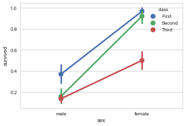
我们还可以使用更多的参数,比如对采用自定义颜色字典对第二个变量的表现进行控制,采用markers和linestyles对于标记和样式进行控制。
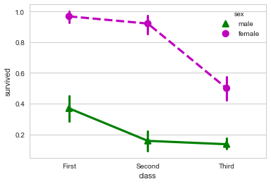
sns.pointplot(x="class",y="survived",hue="sex",
              data=titanic,palette={"male":"g","female":"m"},
             markers=["^","o"],linestyles=["-","--"])
当然,我们还是有办法清楚的表达这两者的关系的情况下不损失任何易懂性。要点在于结合bar和point两种绘图方式。
那么到底要如何结合呢?
折线图的一个好处是,我们只有bar和point两种方式表达数据。而如果我们采用两种均为bar的数据,则很难看出其交互作用。如下图所示:
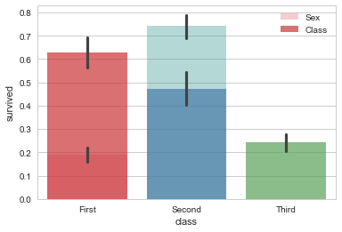
sns.barplot(x="sex",y="survived",data=titanic,alpha=0.4,
            palette="husl",label="Sex")
sns.barplot(x="class",y="survived",data=titanic,alpha=0.7,
            palette="Set1",label="Class")
plt.legend()
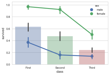
而采用bar和point的方式则可以表示两个分类变量和因变量关系的基础上表示这两个自变量之间的交互。如下图所示:我们可以注意到斜线的斜率不同,但是因为class有三个水平,因此,折线图这一主要优势被掩盖了,我们不太能够注意到斜率的变化。
sns.pointplot(x="class",y="survived",hue="sex",data=titanic)
sns.barplot(x="class",y="survived",data=titanic,alpha=0.4)
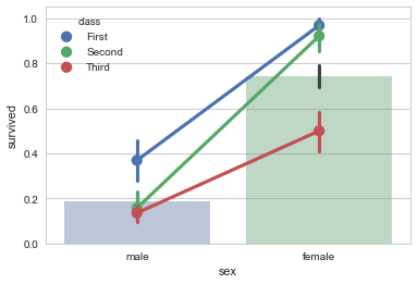
一个改进方案是,尽量让有较少水平的变量作为x轴,这样我们可以就拥有更多线段和更容易观察的斜率。
sns.barplot(x="sex",y="survived",data=titanic,alpha=0.4)
sns.pointplot(x="sex",y="survived",hue="class",data=titanic)
2.2.4 FacetGrid对象和factorplot函数
seaborn.factorplot(x=None, y=None, hue=None, data=None, row=None, col=None, col_wrap=None, estimator=
Parameters:
- x,y,hue 数据集变量 变量名
- date 数据集 数据集名
- row,col 更多分类变量进行平铺显示 变量名
- col_wrap 每行的最高平铺数 整数
- estimator 在每个分类中进行矢量到标量的映射 矢量
- ci 置信区间 浮点数或None
- n_boot 计算置信区间时使用的引导迭代次数 整数
- units 采样单元的标识符,用于执行多级引导和重复测量设计 数据变量或向量数据
- order, hue_order 对应排序列表 字符串列表
- row_order, col_order 对应排序列表 字符串列表
- kind : 可选:point 默认, bar 柱形图, count 频次, box 箱体, violin 提琴, strip 散点,swarm 分散点(具体图形参考文章前部的分类介绍)
- size 每个面的高度(英寸) 标量
- aspect 纵横比 标量
- orient 方向 "v"/"h"
- color 颜色 matplotlib颜色
- palette 调色板 seaborn颜色色板或字典
- legend hue的信息面板 True/False
- legend_out 是否扩展图形,并将信息框绘制在中心右边 True/False
- share{x,y} 共享轴线 True/False
- facet_kws FacetGrid的其他参数 字典
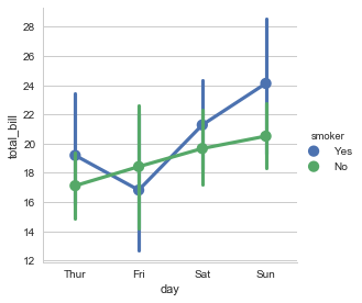
sns.factorplot(x="day",y="total_bill",hue="smoker",data=tips)
<seaborn.axisgrid.FacetGrid at 0x24522aab0b8>
可以更改kind图表类型:
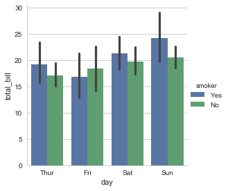
sns.factorplot(x="day",y="total_bill",hue="smoker",data=tips,kind="bar")
<seaborn.axisgrid.FacetGrid at 0x24522aec5f8>
可以使用col参数进行不同图表的绘制:
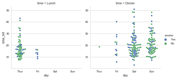
sns.factorplot(x="day",y="total_bill",hue="smoker",
               data=tips,kind="swarm",col="time")
<seaborn.axisgrid.FacetGrid at 0x2452268a5f8>
可以使用size和aspect定义宽度和纵横比:
f, ax = plt.subplots(figsize=(10,10))
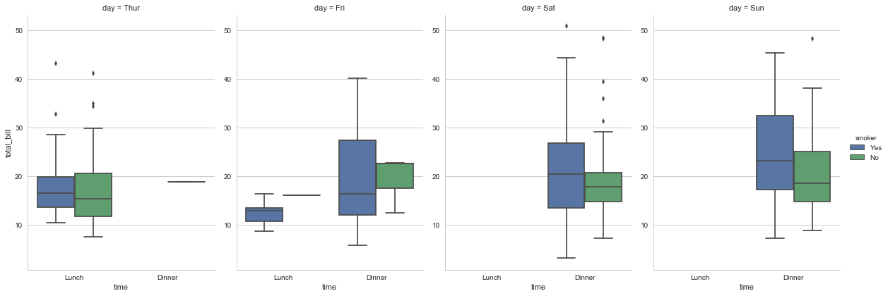
sns.factorplot(x="time",y="total_bill",hue="smoker",
data=tips,kind="box",col="day",size=6,aspect=0.7)
<seaborn.axisgrid.FacetGrid at 0x24525e6c898>
可以通过hue_order控制图例的顺序:
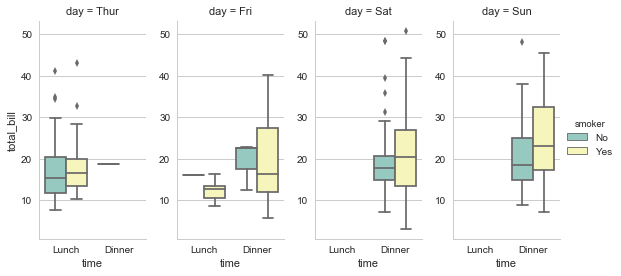
sns.factorplot(x="time", y="total_bill", hue="smoker",hue_order=["No","Yes"]
               ,col="day", data=tips, kind="box", size=4, aspect=.5,
              palette="Set3");
还可以将本节所介绍的这些函数通过PairGrid的map方法传递进行绘图。
g = sns.PairGrid(tips,
                 x_vars=["smoker", "time", "sex"],
                 y_vars=["total_bill", "tip"],
                 aspect=.75, size=3.5)
g.map(sns.violinplot,palette="Set1")
<seaborn.axisgrid.PairGrid at 0x2452823e550>
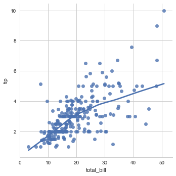
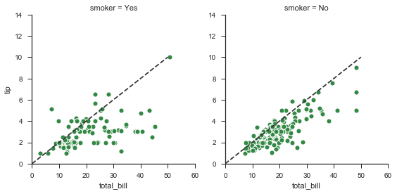
2.3 线性关系可视化
import matplotlib as mpl
两个用来可视化线性关系的函数是 regplot() 和 lmplot()。前者是后者的一个子集。其(regplot)接受Series、ndarray、DataFrame作为x和y,可以只设置x和y,不用data。而lmplot则必须有data参数(必须的),以及x和y(可选的)。
2.3.1 普通线性关系拟合
sns.regplot(x="total_bill", y="tip", data=tips);
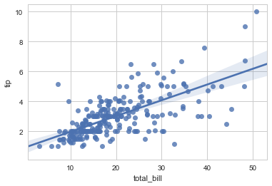
sns.lmplot(x="total_bill", y="tip", data=tips);
sns.lmplot(x=tips.total_bill, y=tips.tip); #错误,必须有data参数
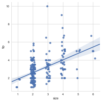
对于像是size这种分类变量,添加一些随机抖动是必要的,这样看起来更清晰,并且其不会影响线性拟合。
sns.lmplot(x="size", y="tip", data=tips,x_jitter=0.0);
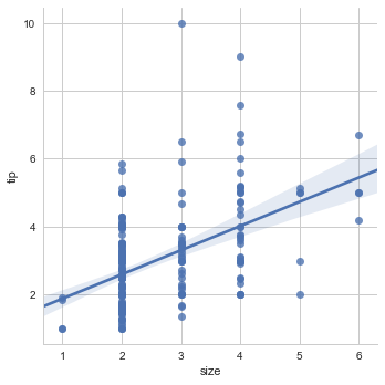
sns.lmplot(x="size", y="tip", data=tips,x_jitter=0.15);
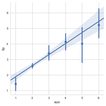
或者可以使用折叠,然后绘制mean的估计和置信区间。
sns.lmplot(x="size", y="tip", data=tips,x_estimator=np.mean);
2.3.2 非线性关系拟合
在很多情况下,线性关系的拟合不是最好的选择,比如非线性拟合
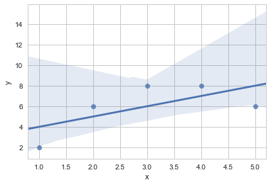
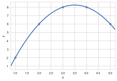
二元函数拟合
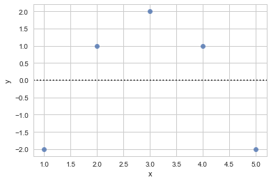
df = pd.DataFrame({"x":[1,2,3,4,5],
                  "y":[2,6,8,8,6],
                  "x2":[1,2,3,4,5],
                  "y2":[2,4,6,8,100]})
df
sns.regplot(x=df.x,y=df.y)
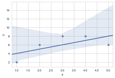
lmplot和regplot()可以拟合多项式回归模型来表示非线性趋势。order表示元
sns.regplot(x=df.x,y=df.y,order=2,ci=None)
在有异常值的情况下,使用robust=True来你和健壮的回归模型。系统会使用不同的损失函数来减小相对较大的残差。
#sns.regplot(x=df.x2,y=df.y2,robust=True)
二元变量拟合
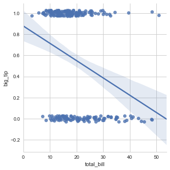
对于二元变量,线性回归的结果不可信:
tips["big_tip"] = (tips.tip / tips.total_bill) > .15
sns.lmplot(x="total_bill", y="big_tip", data=tips,
           y_jitter=.03);
sns.regplot(x=tips.total_bill,y=tips.big_tip,y_jitter=0.1,logistic=True)
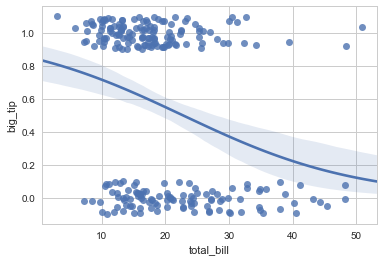
ci=None参数可以获得更快的计算速度...?
快速非线性拟合
此外,使用lowess=True 可以使用一个lowess smoother拟合非参数回归,这种方式不计算置信区间,速度很快。
sns.lmplot(x="total_bill", y="tip", data=tips,
           lowess=True);
residplot()可以用来检查简单线性回归是否适合数据集,如果适合,那么所有值都会随机呈现在y=0附近
df = pd.DataFrame({"x":[1,2,3,4,5],
                  "y":[2,6,8,8,6],
                  "x2":[1,2,3,4,5],
                  "y2":[2,4,6,8,100],
                  "x3":[1,2,3,4,5],
                  "y3":[2,4,6,8,10]})
sns.residplot(x=df.x,y=df.y)
f,ax = plt.subplots()
sns.regplot(x=df.x,y=df.y)
2.3.3 多变量多图形拟合叠加
在拟合图中添加一个或者多个分类变量
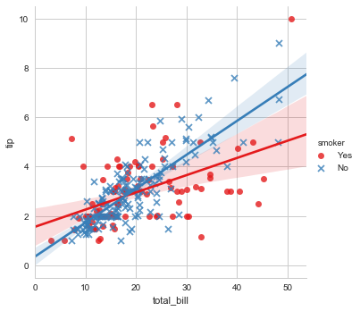
一个有趣的问题是,两个连续变量的关系如何被第三个变量调节而变化?使用hue参数传入一个分类变量可以很方便的看出趋势。
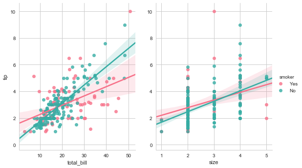
sns.lmplot(x="total_bill", y="tip", hue="smoker", data=tips,
           markers=["o","x"],palette="Set1");
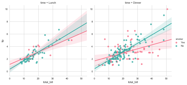
当然,我们也可以添加另外的变量,绘制多个facet。只用将参数传递给col即可。如果有第三个分类变量需要检查,使用row参数即可。
sns.lmplot(x="total_bill", y="tip", hue="smoker", col="time",
           data=tips,palette="husl");
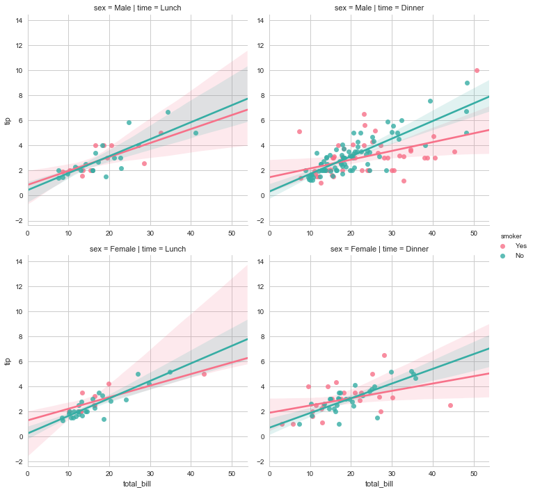
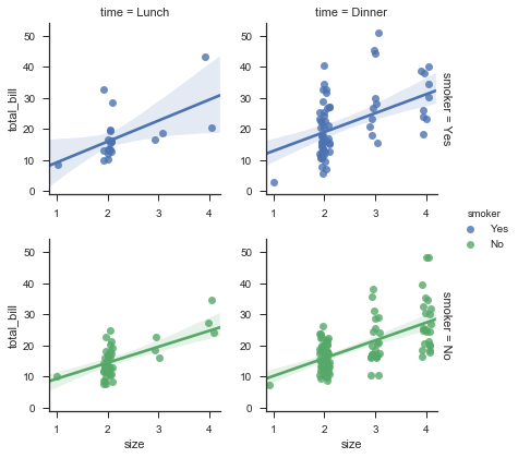
sns.lmplot(x="total_bill", y="tip", hue="smoker",
           col="time", row="sex",data=tips,palette="husl");
regplot和lmplot的多图形绘制
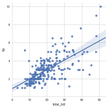
在之前我们看到了regplot和lmplot的一些差别,比如形状不同。这是因为,regplot总是绘制到特定的轴上。这意味着,我们可以用regplot制作多面板图形。
相反,lmplot的大小和形状是通过FacetGrid中的size和aspect参数调节的。
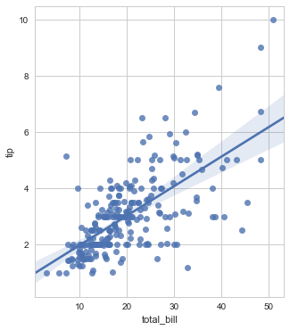
f, ax = plt.subplots(figsize=(5, 6))
sns.regplot(x="total_bill", y="tip", data=tips, ax=ax);
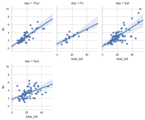
sns.lmplot(x="total_bill", y="tip", col="day", data=tips,
           col_wrap=3, size=3,aspect=0.8);
#col_wrap 控制每行图形个数,size控制总图形的长度
和jointplot/pairplot 共同使用
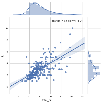
在其他背景上绘制的话,使用regplt()。比如,我们需要在jointplot()图形上叠加线性关系:
sns.jointplot(x="total_bill", y="tip", data=tips, kind="reg");
或者使用pairplot()
pairplot()和lmplot()很像,它们都采用aspect、size等控制图像,而不是类似jointplot和regplot这种按照axes轴进行绘制。
sns.pairplot(tips, x_vars=["total_bill", "size"], y_vars=["tip"],
             size=5, aspect=.8, kind="reg", hue="smoker",palette="husl");
3. GRIDS
sns.set(style="ticks")
在之前,我们有两种选择,其一是使用低层次的matplotlib API绘制,很多sns定义的函数直接返回AxesSubplot,比如sns.distplot()、sns.swarmolot()、sns.barplot(),它们可以和plt.scatter()这种matplotlib函数一起使用。其二是使用高层次的sns 自定对象的API,包括factorplot()函数和其返回的FacetGrid对象,或者jointplot&pairplot函数和JointGrid、PairGrid对象。此外,还有一些函数间接的调用了FacetGrid,比如sns.lmplot()函数。
其中FacetGrid和pairplot函数的参数类似,而jointplot的参数自成一派。
本章节主要讲述如何直接调用XXXGrid对象来创建一个对象后,应用map来进行各种自定义绘制。
自然,在创建Grid对象的时候,尽量做到图像和绘制内容的分离,对于对象可用的参数,可以参考API手册。
3.1 使用FacetGrid绘制不同水平关系
比如下面段代码,调用了FG对象,传入了一个数据集和col参数,以根据col参数对应变量的水平将图形横向分成几部分,这样返回的是一个空图形,我们唯一需要做的就是传入一个绘图函数,进行自变量和因变量的绘制。
tips = sns.load_dataset("tips")
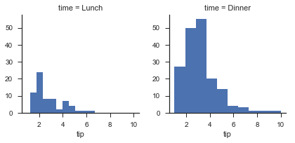
g = sns.FacetGrid(tips,col="time")
3.1.1 使用Map函数进行图类的绘制
使用map传入一个绘图函数,定义这个函数所需要的参数。返回FG对象。
g = sns.FacetGrid(tips,col="time")
g.map(plt.hist,"tip")
col、row和hue
对于FG对象,我们可以设置三个维度:col、hue和row,col和row的变量个数乘积就是子图形的个数。使用add_legend()方法添加图例。
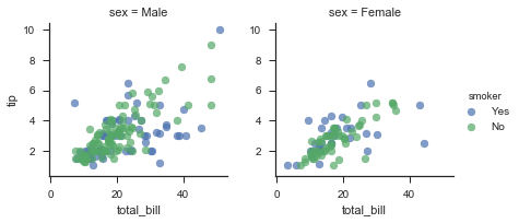
g = sns.FacetGrid(tips,col="sex",hue="smoker")
g.map(plt.scatter,"total_bill","tip",alpha=0.7)
g.add_legend()
使用margin_titles=True来合并标题。
g = sns.FacetGrid(tips,col="time",row="smoker",hue="smoker",margin_titles=True)
g.map(sns.regplot,"size","total_bill",x_jitter=0.1)
g.add_legend()
使用size和aspect参数来定义尺寸和比例
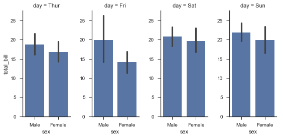
g = sns.FacetGrid(tips, col="day", size=4, aspect=.5)
g.map(sns.barplot, "sex", "total_bill");
传递参数给gridspec_kw字典以更加个性化的设置需要显示的数量:
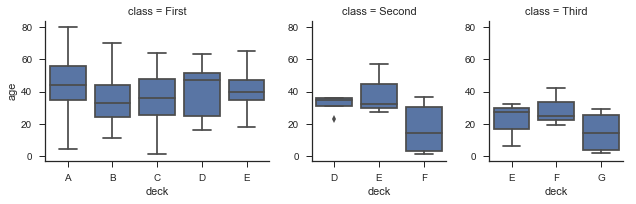
titanic = sns.load_dataset("titanic")
titanic = titanic.assign(deck=titanic.deck.astype(object)).sort_values("deck")
g = sns.FacetGrid(titanic, col="class", sharex=False,
                  gridspec_kws={"width_ratios": [5, 3, 3]})#x轴显示个数
g.map(sns.boxplot, "deck", "age");
当然,我们还能定义数据呈现顺序:
使用适当的*_order参数来指定任何平面维度的数据顺序
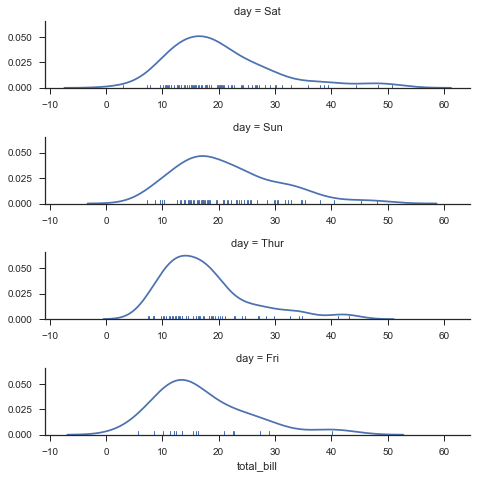
ordered_days = tips.day.value_counts().index
g = sns.FacetGrid(tips, row="day", row_order=ordered_days,
                  size=1.7, aspect=4,)
g.map(sns.distplot, "total_bill", hist=False, rug=True);
还可以自定义颜色,或者指定每个标签以不同的颜色。
使用palette自定义颜色
需要注意,edgecolor和lienwidth这种参数是在scatter中进行设置的,这一点看起来有些诡异。
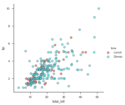
g = sns.FacetGrid(tips, hue="time", palette="hls", size=5)
g.map(plt.scatter, "total_bill", "tip", s=50, alpha=.7,
      linewidth=.5, edgecolor="black")
g.add_legend();
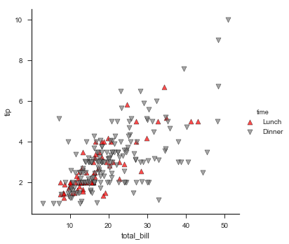
g = sns.FacetGrid(tips, hue="time", palette={"Dinner":"gray","Lunch":"red"}, size=5)
g.map(plt.scatter, "total_bill", "tip", s=50, alpha=.7,
      linewidth=.5, edgecolor="black")
g.add_legend();

使用hue_kws来传递一个字典,来进一步自定义其它没有被作为参数的但是可以调节的绘图参数。
g = sns.FacetGrid(tips, hue="time", palette={"Dinner":"gray","Lunch":"red"},
                  size=5,hue_kws={"marker":["^","v"]})
g.map(plt.scatter, "total_bill", "tip", s=50, alpha=.7,
      linewidth=.5, edgecolor="black")
g.add_legend();
下面这样写是错误的,可以很清楚地看到错误的原因:对于map,我们需要scatter函数所做的仅仅是在不同空白格子里绘制total_bill和tip的关系,但是其不涉及hue,也就是time这个分类变量,这个变量是由更高层级的地方设计的。
g = sns.FacetGrid(tips, hue="time", palette={"Dinner":"gray","Lunch":"red"},
                  size=5)
g.map(plt.scatter, "total_bill", "tip",marker=["^","v"])
使用col_wrap参数控制换行
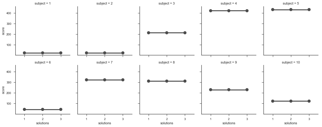
如果我们的这个变量有很多水平,一行绘制不完,那么就需要使用col_wrap参数进行换行,在这种情况下,row参数将不可使用。
df = pd.DataFrame({
    "subject":[1,2,3,4,5,6,7,8,9,10,1,2,3,4,5,6,7,8,9,10,1,2,3,4,5,6,7,8,9,10],
    "score":[23,23,213,421,432,45,324,312,231,123,23,23,213,421,432,
    45,324,312,231,123,23,23,213,421,432,45,324,312,231,123],
    "solutions":[1,1,1,1,1,1,1,1,1,1,2,2,2,2,2,2,2,2,2,2,3,3,3,3,3,3,3,3,3,3]
})
df
g = sns.FacetGrid(df, col="subject", col_wrap=5)
g.map(sns.pointplot, "solutions", "score", color=".3", ci=None);
3.1.2 使用Set函数设置标签和刻度
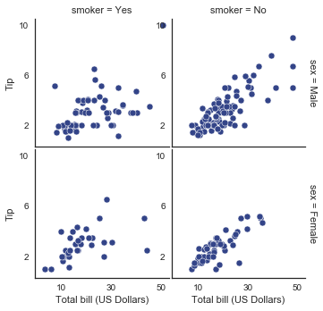
除了map方法,我们可以使用一些其他方法,这些方法作用于更高层次,最常用的就是FacetGrid.set(),或者FG.set_axis_labels()。
with sns.axes_style("white"):
    g = sns.FacetGrid(tips, row="sex", col="smoker", margin_titles=True, size=2.5)
g.map(plt.scatter, "total_bill", "tip", color="#334488", edgecolor="white", lw=.5);
g.set_axis_labels("Total bill (US Dollars)", "Tip");
g.set(xticks=[10, 30, 50], yticks=[2, 6, 10]);
g.fig.subplots_adjust(wspace=.02, hspace=.02);
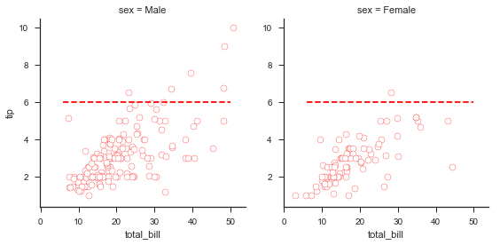
3.1.3 遍历FG.axes对象对子图操作
我们还可以调用每个子图的ax来进行更加子类化的绘制,比如:
使用for循环遍历g.axes.flat即可。
g = sns.FacetGrid(tips, col="smoker", margin_titles=True, size=4)
g.map(plt.scatter, "total_bill", "tip", color="#338844",
      edgecolor="white", s=50, lw=1)
for ax in g.axes.flat:
    ax.plot((0, 50), (0, .2 * 50), c=".2", ls="--")
g.set(xlim=(0, 60), ylim=(0, 14));
3.1.4 自定义绘图函数的使用
绘制自定义函数:
def myplot(x,y,**kwargs):
    plt.plot((6,50),(6,6),c="r",linestyle="--")
    plt.scatter(x,y,**kwargs)

g = sns.FacetGrid(tips, col="sex", size=4)
g.map(myplot, "total_bill","tip",color="w",edgecolor="r");
3.2 使用PairGrid绘制成对关系
和FacetGrid相似但又不同的是,PairGrid的每个子图形包含不同的关系,而FG则包含相同的关系(只不过是不同级别的)。此外,它们都采用类似的方式工作,比如先定义对象,然后使用map进行子图绘制。
g = sns.PairGrid(iris)
g.map(sns.regplot,fit_reg=False)
分别对于对角线和两个三角绘制不同图形
g = sns.PairGrid(iris,hue="species")
g.map_diag(sns.distplot)
g.map_offdiag(sns.regplot,fit_reg=False)
在上下三角使用不同的图类型
你可以在上下三角形中定义不同的数据:
g = sns.PairGrid(iris, hue="species")
g.map_upper(plt.scatter)
g.map_lower(sns.kdeplot, cmap="Blues_d")
g.map_diag(sns.kdeplot, legend=False);
直接作为参数传递对角线和上下三角的类型、设置调色板和图片尺寸等
其实,我们也可以使用内置的一些参数来设置不同地方的图标类型,而不用调用map_dialog和map_offdialog
比如,在pairplot参数中直接写入diag_kind。这里还可以定义别的参数,比如调色板和size等。
g = sns.pairplot(iris, hue="species", palette="Set2", diag_kind="kde", size=2.5)
你甚至可以制定使用什么数据:
仅使用数据集中的某些数据
g = sns.PairGrid(iris, vars=["sepal_length","sepal_width"], hue="species")
g.map_offdiag(plt.scatter)
g.map_diag(sns.distplot)
仅使用数据集中的某些数据(无对角线版本)
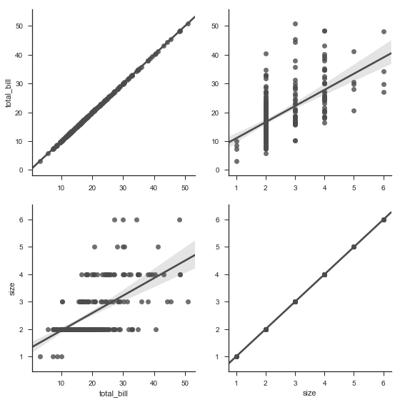
再或者,对角线只是一种特殊情况,我们完全可以不要对角线,分别传入y_vars和x_vars变量而不是单单生命vars变量即可。
g = sns.PairGrid(tips, y_vars=["total_bill", "size"],
                 x_vars=["total_bill", "size"], size=4)
g.map(sns.regplot, color=".3")
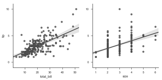
g = sns.PairGrid(tips, y_vars=["tip"], x_vars=["total_bill", "size"], size=4)
g.map(sns.regplot, color=".3")
g.set(ylim=(-1, 11), yticks=[0, 5, 10]);
——————————————————————————————————————
更新日志
2018-03-29 添加笔记
2018-03-30 添加 2.2、2.3部分
2018-03-31 添加 3.1、3.2部分